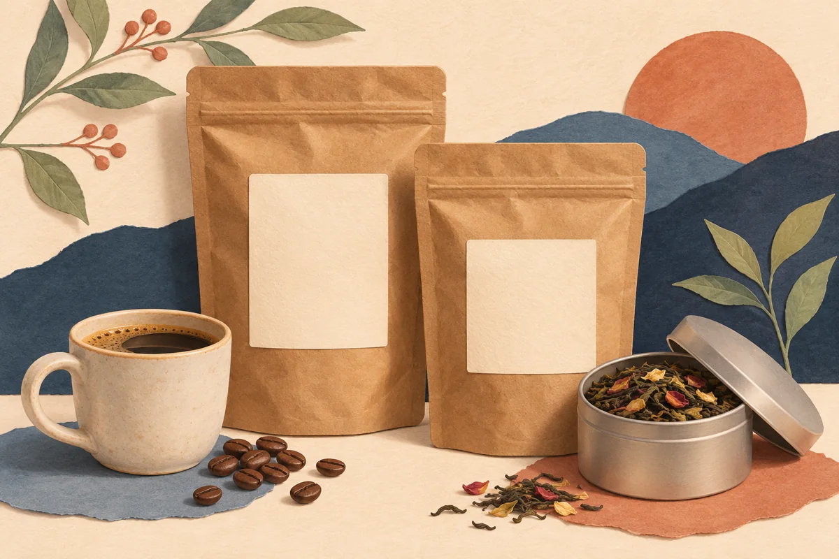
Letter spacing changes the distance between characters. On a coffee label it can make a short brand name feel open, but excessive spacing can make a long origin name difficult to scan. Treat it as a controlled typography decision after you have chosen the font, wording and final label dimensions.
01
Separate character spacing from other text changes
Letter spacing changes the gaps across a word or phrase. Text-box width changes the room available for that text and may alter wrapping. Font size changes the characters themselves. When all three change together, it becomes difficult to identify why a label suddenly looks wider or less readable.
Make a duplicate of the page and choose one text role to adjust. For an illustrative coffee bag, start with the brand heading while keeping the product name and roast information unchanged. Record the current font, size and spacing so you can restore the original if the experiment adds no practical benefit.
02
Compare short and long names in the same system
Use the spacing control on the selected text and make a modest change. Keep the full line in view, including its relationship to the label’s edges. A more widely spaced heading may need more width and can push a long name into a second line even though its font size has not changed.
Compare “HOUSE BLEND” with “GUATEMALA HUEHUETENANGO” in the same heading role. The shorter name may tolerate more space, while the longer name needs a calmer setting. Choose a rule that works across the range or document an explicit long-name variation instead of making every product an unrelated design.
03
Judge word shapes and alignment at physical size
Zooming in helps you spot overlaps, but a large monitor can make widely spaced text seem easier to read than it is on a small pouch. Export a comparison and print both versions at actual size. View the product name at a realistic handling distance with the bag standing upright.
Watch for gaps that make a word feel like separate letters and for headings that appear visually off center. A text box can be mathematically centered while the word’s shape feels uneven. Correct the overall placement only after choosing the spacing, then check the surrounding roast, origin and weight information again.
| Symptom | First adjustment to review |
|---|---|
| Letters feel disconnected | Reduce excessive letter spacing |
| Long name wraps unexpectedly | Review spacing and available width |
| Tiny details remain hard to read | Review font size and typeface, then proof |
04
Apply a deliberate rule across variants
Once the heading is approved, update the equivalent text role on the other variants. Avoid applying a display heading’s wide spacing to ingredients, instructions or other compact information. Those blocks have different reading needs and should retain their own clear settings at the actual printed size.
Save a note such as “brand heading uses the approved master setting; origin names use the long-name layout when needed.” This gives a future editor a decision rule. Check the final export after applying it, since manual line breaks and unusually long names can still change the label’s balance.
BEFORE YOUR NEXT STEP
Your practical checklist
- Duplicate the page before comparing.
- Keep font size and box width stable.
- Check the longest name in the range.
- Approve spacing on a physical proof.
Questions & answers
Is letter spacing the same as line spacing?+
No. Letter spacing affects gaps between characters. Line spacing affects the distance between lines in a text block and needs a separate check.
Should every label heading use wide spacing?+
No. The appropriate setting depends on the font, name length and label size. Compare actual wording rather than applying one decorative effect everywhere.
Sources & further reading
Official references for the technical points in this guide. Check current specifications before production.