A syrup flask can offer a broad front but very little flat space near its shoulder. A small handle, raised decoration or curved base can interrupt an otherwise appealing label shape. Build the design around those physical features instead of centering a rectangle on the whole bottle silhouette.
01
Identify the bottle’s uninterrupted panels
Berlin Packaging’s syrup bottle range includes different materials and shapes. Shortlist the format that suits the business’s established product and packing process, then request the actual bottle drawing. This design decision does not determine filling suitability, preservation or storage conditions; those belong to the appropriate product and supplier review.
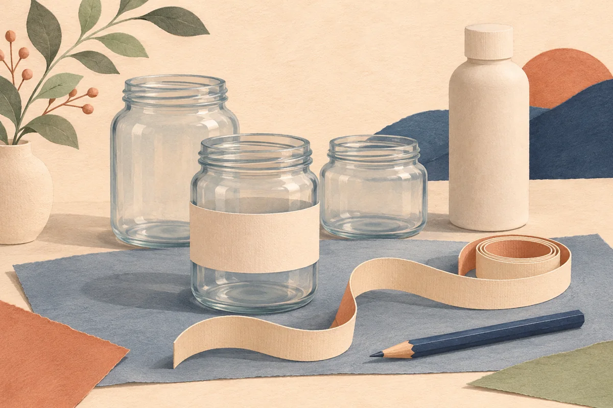
On the physical sample, trace the front panel between the shoulder, handle attachment and lower curve. Check the back independently. A flask can have different usable areas on its two sides. Photograph any embossed marks so an artwork editor can see where a smooth label would otherwise bridge a raised detail.
02
Try a shaped panel before enlarging a rectangle
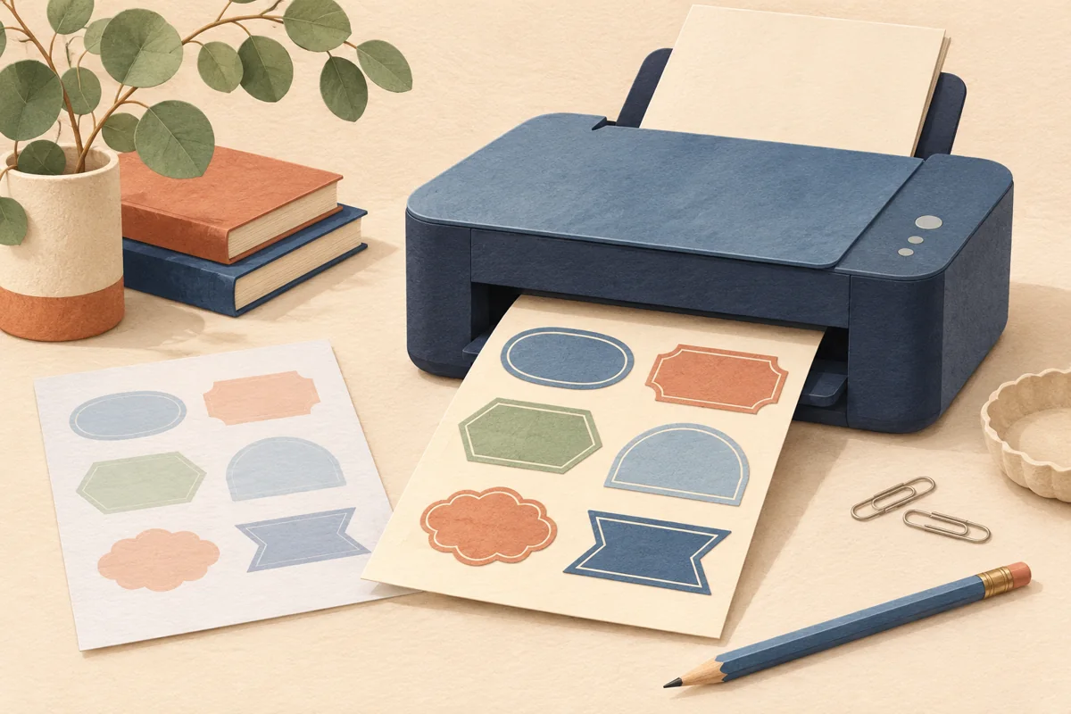
For an illustrative gift flask, compare a modest rectangular front with a slightly tapered paper panel. Place the same product name and brand on both. The shaped panel may follow the glass visually, while the rectangle may be simpler to produce. Ask the printer about available cut shapes before choosing a custom outline.
Do not make the label so large that the handle becomes visually crowded or the border reaches onto the shoulder. Preserve space around distinctive container features deliberately. A small clear gap can make the artwork look more considered than an oversized label designed to occupy every available millimeter.
| Bottle feature | Label response |
|---|---|
| Small handle | Leave visible separation |
| Embossed detail | Keep the adhesive panel clear |
| Gift neck tag | Check the natural hanging position |
03
Keep supporting statements verifiable
Place the approved syrup identity, quantity and any other required business wording in a readable hierarchy. If the design includes origin, grade or production statements, use exactly the substantiated wording supplied by the business. A traditional-looking illustration is not evidence for a geographic or quality claim.
Use the back panel for supporting detail when it improves the front. Check that a rear label does not cover the only useful product view if transparency is part of the presentation. Compare the complete bottle against both light and dark backgrounds so contrast does not depend on one styled photograph.
04
Review the gift and retail orientations
Add any neck tag, ribbon and outer box before approving the front. A tag that hangs over the product name changes the design, even if the bottle looked balanced without it. Stand the bottle upright and lay it in its intended gift tray to inspect both viewing directions.
Record the container model, closure, front and back label dimensions and approved artwork files together. Repeat the fit check after any bottle substitution. Coordinated digital layouts can provide a starting visual system, but the exact bottle geometry and printer’s specifications establish the usable production artwork.
BEFORE YOUR NEXT STEP
Your practical checklist
- Map front and back separately.
- Mark raised glass and handle attachments.
- Verify every product statement.
- Review the fully decorated gift bottle.
Questions & answers
Does a flask shape guarantee a large flat label area?+
No. The shoulder, base and embossed features can reduce the usable panel. Measure a physical sample of the exact bottle.
Can an illustration imply a syrup grade or origin?+
Use substantiated statements supplied by the business. Artwork should not create a product claim that the written information cannot support.
Sources & further reading
Official references for the technical points in this guide. Check current specifications before production.