Nut butter jars often have a broad lid and a relatively short side panel. A long front label can disappear around the sides, while a tiny texture word can make smooth and crunchy versions hard to distinguish. Plan those two surfaces together before building the artwork.
01
Measure the straight wall beneath the lid
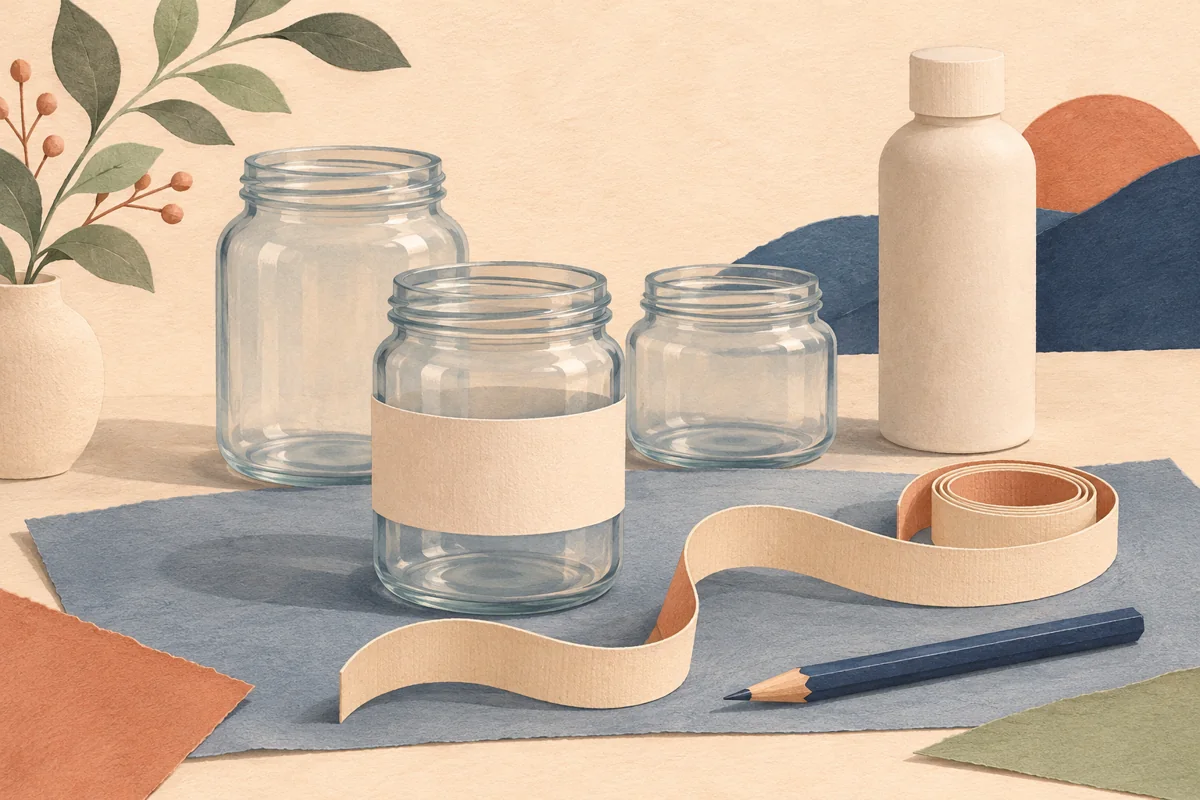
Fit the intended closure to a sample jar and mark the straight sidewall below it. Leave the shoulder and lower curve outside the initial paper panel. The overall jar height includes areas that may not support a flat label. A wide opening is a container feature, not a measurement of usable artwork space.
Berlin Packaging lists wide-mouth food jars among its formats, including uses such as nut butter. Request the drawing and sample for the exact model you are considering. If two jars have similar stated capacity, compare their actual side panels and lid overhang rather than treating them as interchangeable label sizes.
02
Make texture a deliberate level in the hierarchy
Imagine Almond Butter, Crunchy Almond Butter and Cocoa Almond Spread. Test these names on the same front layout. The word Crunchy needs a recognizable position if texture drives the choice. It should not look like a minor production note underneath a much larger decorative slogan.
Build a small written matrix with the approved front identity, texture descriptor and product code. Use it to compare the label, online listing and packing reference. When a flavored product needs a different name, preserve the clarity of the wording rather than forcing every recipe into an identical naming formula.
| Element | Purpose |
|---|---|
| Front name | Identify the exact product |
| Texture word | Separate smooth and crunchy choices |
| Lid repeat | Recognize the variant from above |
03
Use the lid without splitting the information
A lid sticker can repeat a short variant name for a top-down display. Keep it consistent with the front label so a loose lid does not identify a different product. Make sure the lid design fits within any pressed inset and does not interfere with normal opening.
Do not distribute a single product name across separate surfaces in a way that requires the customer to rotate the jar to understand it. The front should still identify the item on its own. Use the larger supporting panel for owner-approved ingredient, quantity and other details, keeping enough room for readable wording.
04
Approve the complete handled package
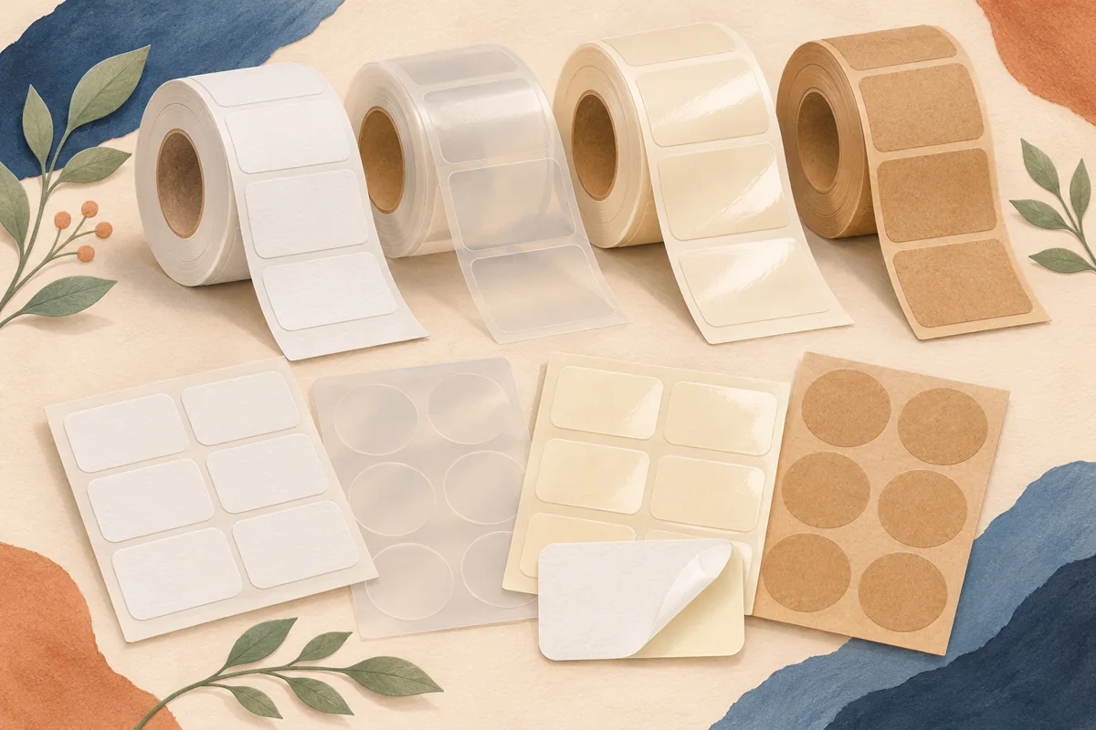
Discuss the expected handling conditions with the label supplier and compare suitable stock on the real container. A material name alone does not establish the performance of the complete printed label. Check the finished sample, including its ink, finish and adhesive, through an appropriate packaging trial.
Photograph one closed jar from the front and above, then compare it with neighboring variants on a shelf. Keep a reference of the approved label height, lid position and artwork revision. The goal is a jar that remains easy to choose and reorder, with its visual identity supported by accurate product information.
BEFORE YOUR NEXT STEP
Your practical checklist
- Measure the straight wall with the lid fitted.
- Test the longest approved name.
- Repeat the same variant on the lid.
- Keep label and listing identities aligned.
Questions & answers
Can I use a wider label to fit more wording?+
Only if it stays readable on the jar. More width can send essential text around the curve; compare a rear information panel or revise the layout.
Should smooth and crunchy use different colors?+
Color can support the distinction, but the written texture should remain clear so the choice does not depend on color alone.
Sources & further reading
Official references for the technical points in this guide. Check current specifications before production.