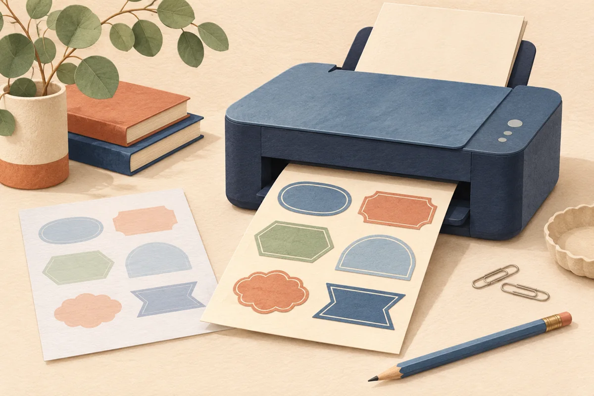
Textured label paper can add character before a customer reads a word, but its surface also becomes part of the artwork. Fine botanical lines, small lettering and broad color fields need to be judged on that surface. A plain paper swatch helps you choose a feel; a printed proof helps you choose a usable label.
01
Describe the texture you are looking for
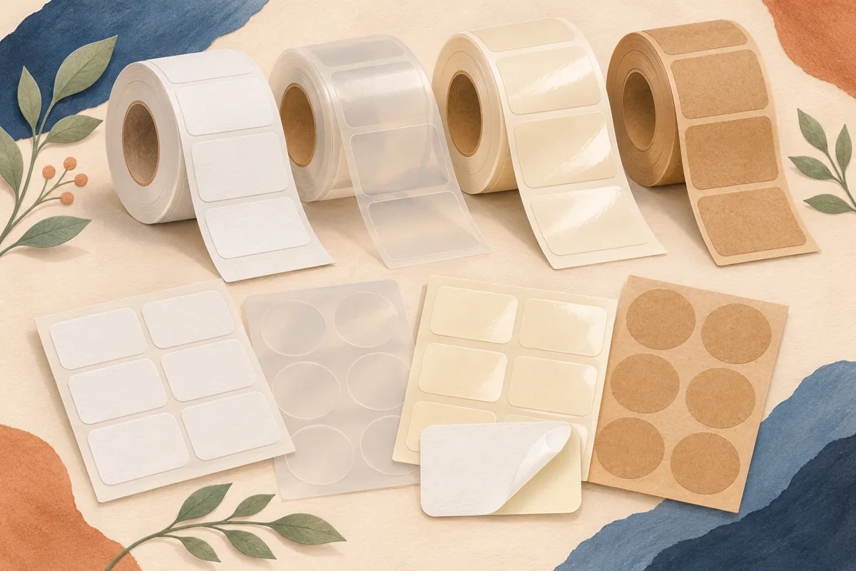
Ask the supplier for named stock samples rather than a general “rustic paper” option. Linen, felt and estate-style papers can have different surface patterns and visual tones. Blue Label’s stock guide distinguishes textured papers among its available label options, illustrating why an exact material name matters.
Set the samples beside the container and other packaging. A texture that suits a dark glass jar may compete with a strongly patterned outer box. Choose the part of the package that should carry the tactile detail so the remaining elements have a clear supporting role.
02
Proof the details that carry your identity
Build a compact test panel containing the actual wordmark, the smallest proposed wording, a representative botanical line and a flat color area. Use those real design elements rather than only a supplier’s attractive demonstration artwork. They reveal the questions your label actually needs answered.
For a honey range, compare one fine bee illustration with a simplified version on the same paper. If the fine internal lines become difficult to distinguish, ask whether the artwork needs adjustment or a smoother stock would serve it better. Keep the variety name readable before preserving a decorative detail.
03
Compare texture without changing the whole design
Use one approved layout for the first material comparison. If you also change the font, background and label size, it becomes difficult to tell what the paper contributes. Record one clear observation for each sample and keep the physical proofs numbered.
A texture may interrupt a very thin rule differently from a heavy wordmark. Review the complete hierarchy rather than declaring a stock “good” or “bad” from one isolated detail. A small redesign might resolve the conflict, but the revised artwork still needs a new proof.
| Proof feature | Inspect at finished size |
|---|---|
| Thin illustration | Continuity of small lines |
| Small wording | Open letter shapes and spacing |
| Color field | Even appearance appropriate to the stock |
04
Confirm performance and reorder details
Tell the printer whether the package encounters dry shelves, damp hands, oil or condensation. Request a stock and adhesive recommendation for those conditions. A textured look alone does not identify how the label will perform, and a protective treatment can also change its feel or appearance.
Archive the stock code, finish and accepted print sample with the final artwork. If a supplier suggests a replacement paper, compare it before reordering the full quantity. A botanical Canva layout can provide the starting composition; the paper, adhesive and finished label construction must be selected separately.
BEFORE YOUR NEXT STEP
Your practical checklist
- Obtain named texture samples.
- Proof real brand details and smallest wording.
- Keep a smooth control sample.
- Confirm stock, adhesive and finish as one construction.
Questions & answers
Should textured labels use only large type?+
There is no single rule for every stock and press. Proof the actual small wording and follow the printer’s requirements for that material.
Can a laminate change the texture?+
It can change the finished surface. Ask for a sample of the complete quoted construction rather than judging the uncoated paper alone.
Sources & further reading
Official references for the technical points in this guide. Check current specifications before production.