Paired wine labels create two separate design decisions that still need to behave as one package. A front can look balanced while the back is misplaced, uses another release’s wording or becomes hard to read on a curved shoulder. Start by defining the bottle and the relationship between the panels, then review the complete pack.
01
Let the bottle shape establish the boundaries
Record the bottle reference and closure before setting label height. Berlin Packaging distinguishes high-shouldered Claret or Bordeaux shapes from more gradually sloping Burgundy shapes. These broad families help describe a silhouette, but the exact model’s drawing and physical sample determine its usable label space.
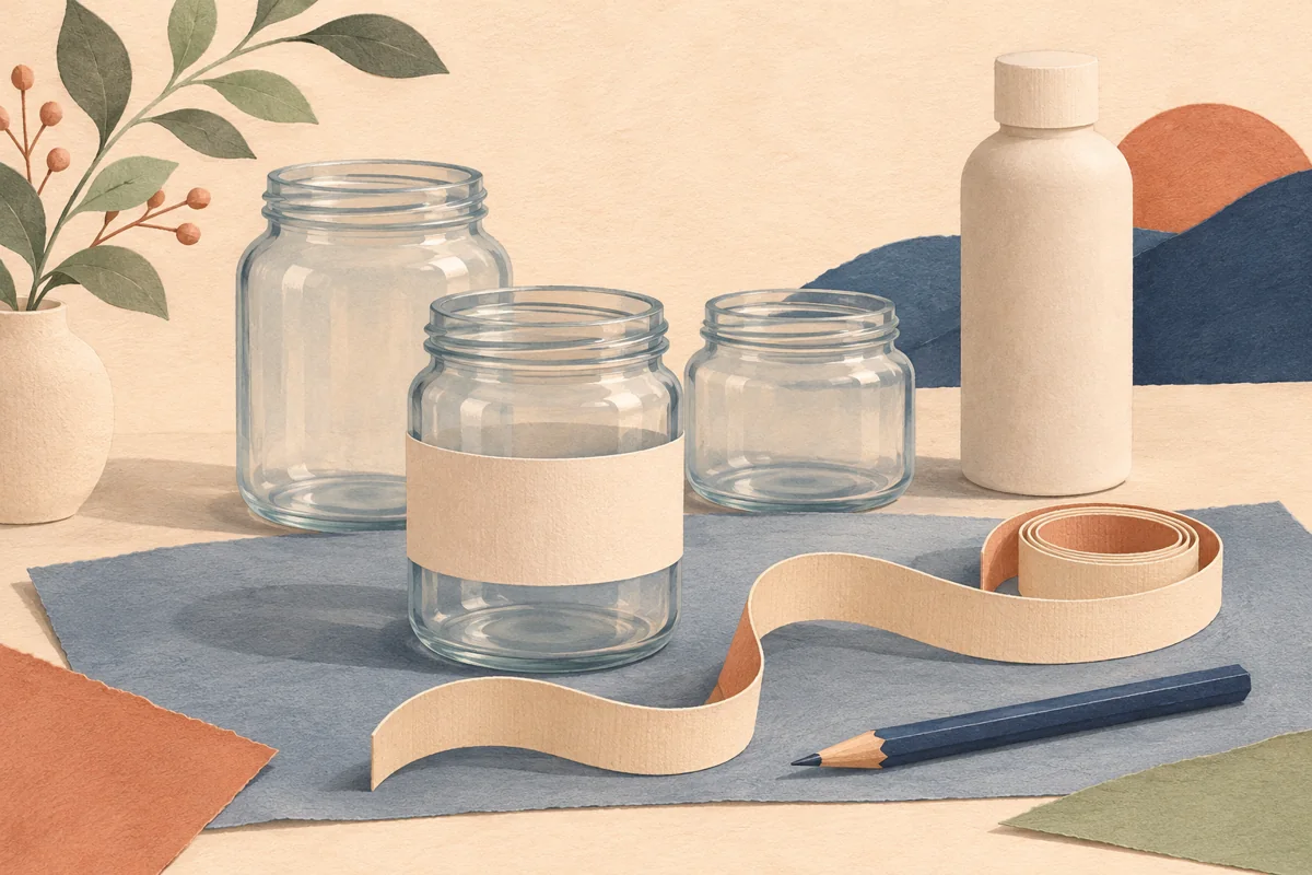
Mark the shoulder transition, base curve and any embossing on a paper trial. A tall front panel may sit comfortably on one model while reaching the curve on another. Do not treat a shared capacity as permission to reuse the same label dimensions across the complete range.
02
Create a repeatable front and back relationship
Choose a stable reference for orienting the panels, taking any bottle seam or embossing into account. Apply paper fronts and backs, then look at the bottle from both sides and at a slight angle. Decide whether matching lower edges, vertical centers or another relationship produces the clearest result.
For an illustrative pair, compare a tall narrow front with a shorter, wider back. Matching their lower edges may make the assembled bottle feel deliberate even though their outlines differ. Record the approved relationship with a photograph and measurements; an unlabeled note saying centered leaves too much interpretation.
| Record | What it prevents |
|---|---|
| Bottle model | Artwork drifting onto a different shoulder |
| Front and back revision | Mismatched release copy |
| Placement reference | Inconsistent panel alignment |
03
Treat the two files as a controlled pair
Use a register with the approved product name, release identifier, bottle format and both artwork filenames. Check the front and rear product identity before exporting. A nearly identical thumbnail can conceal a changed word or an older release reference, especially when several bottles share the same botanical artwork.
Reserve the back panel around copy already approved for the actual wine and sales context. This guide does not determine which statements are required or approve a label for legal use. If the supplied wording will not fit readably, revise the panel design with the responsible business rather than deleting text to preserve decoration.
04
Approve the complete bottle and its presentation
Apply both print proofs to one assembled sample and inspect it beside other wines in the range. Check that a shelf edge, gift sleeve or neck decoration does not hide the intended identity. Turn the bottle naturally and confirm the back panel is easy to locate without hunting for its first line.
Keep the approved sample or a complete photographic record with the artwork release list. When the bottle, copy or printing process changes, review the pair again. Coordinated digital beverage layouts can support the design work, but their available dimensions and editing options need checking against this measured package.
BEFORE YOUR NEXT STEP
Your practical checklist
- Identify the exact bottle model.
- Define a front-to-back placement reference.
- Pair the correct files by product and release.
- Approve both panels on one complete bottle.
Questions & answers
Must the front and back labels be the same size?+
No. They can have different roles and proportions. Compare their relationship on the bottle and preserve enough readable space for the approved information.
Can I reuse another wine’s supporting wording?+
Use the business’s approved copy for the exact product and release. Similar bottles or shared artwork do not establish that the wording is interchangeable.
Sources & further reading
Official references for the technical points in this guide. Check current specifications before production.