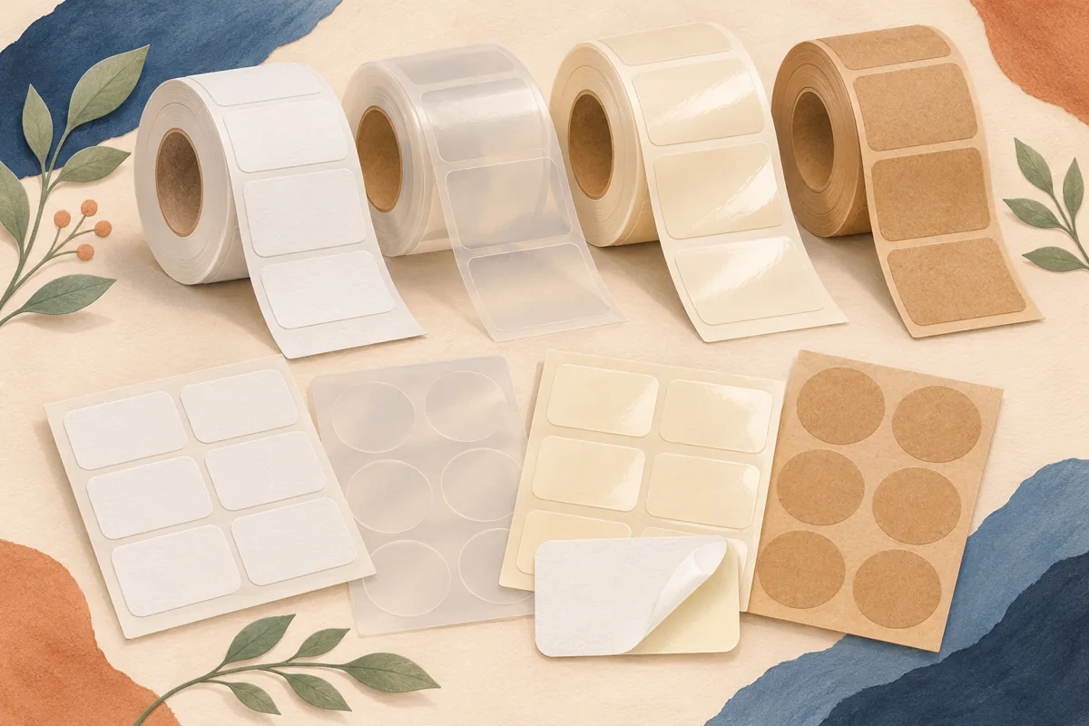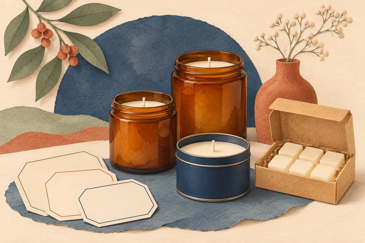
Clear candle labels let the vessel and wax show through. That also makes the jar part of the design. A scent name can look crisp over ivory wax and almost disappear when it sits over a dark shelf or an amber glass wall. Proof your artwork against the backgrounds a buyer will actually see.
01
Mark where the wax shows behind the label
Set a cold, finished jar on a shelf at the height customers are likely to see it. Hold a paper outline where the clear label will sit. Mark which parts of the name lie over the wax and which lie over the glass above it. Check the jar from the side as well, since the wall may curve away from the center of the label.
Use an empty matching jar or a removable colored insert as a second proof background. The insert is a visual stand-in for a different fill level, so there’s no need to light the candle to decide whether the lettering reads.
02
Decide which parts need white behind them
On a clear stock, an unprinted white area can remain transparent. Avery’s clear-label guidance distinguishes an actual white-ink print process from standard printing that leaves white areas blank. Ask your printer if it offers white ink and whether it can place white under selected elements only.
One practical brief is to back the scent name and the small product line with white, while leaving the surrounding glass visible. A printer might ask for a separate white plate or a named spot color. Ask for its instructions before exporting the Canva file.
03
Run a three-background proof
Imagine a clear tumbler with pale wax and a navy design for an illustrative scent called Orchard Fog. Use the same label artwork for three proofs. Look at it against the pale wax, against exposed glass with a dark card behind the jar, and against a midtone shelf backdrop. Write down which text disappears first in each view.
If the scent line is readable in two of the three views, change one thing for the next sample. Increase the weight of that line, specify white underprint under it, or move it to a different part of the vessel. Compare both samples under the same light.
| Proof view | What to look for |
|---|---|
| Over wax | Does the product name hold its shape? |
| Over exposed glass | Does the shelf or surface behind the jar show through the text? |
| In a listing photo | Can you still read the scent name at thumbnail size? |
04
Approve the physical stock and the listing photo
Ask for a sample of the exact glossy or matte clear stock. A frosted appearance can be a good fit for a softly finished jar, while a transparent look may call for a different stock. Check where the cut edge catches light and whether the adhesive’s appearance changes over your particular glass.
Photograph the approved jar against the background you use in your shop. A beautiful proof in the hand can lose its text when the glass reflects a window or light box. Move the lighting or angle first. If a buyer still cannot read the name at a small size, revise the artwork before ordering a larger run.
BEFORE YOUR NEXT STEP
Your practical checklist
- Check the design against the wax and exposed glass.
- Get the printer’s white ink instructions.
- Proof the exact stock on the final jar.
- Approve the name in a thumbnail-size listing photo.
Questions & answers
Do I need white ink for every clear candle label?+
No. A dark design may read over a pale background. A physical proof tells you which elements need an opaque backing.
Can I use the same art on amber and clear jars?+
Proof each combination first. Dark amber and clear glass can make the same artwork read differently.
Sources & further reading
Official references for the technical points in this guide. Check current specifications before production.