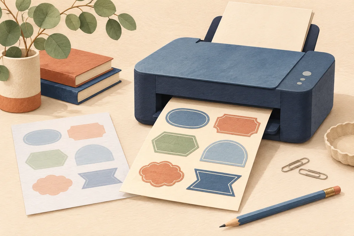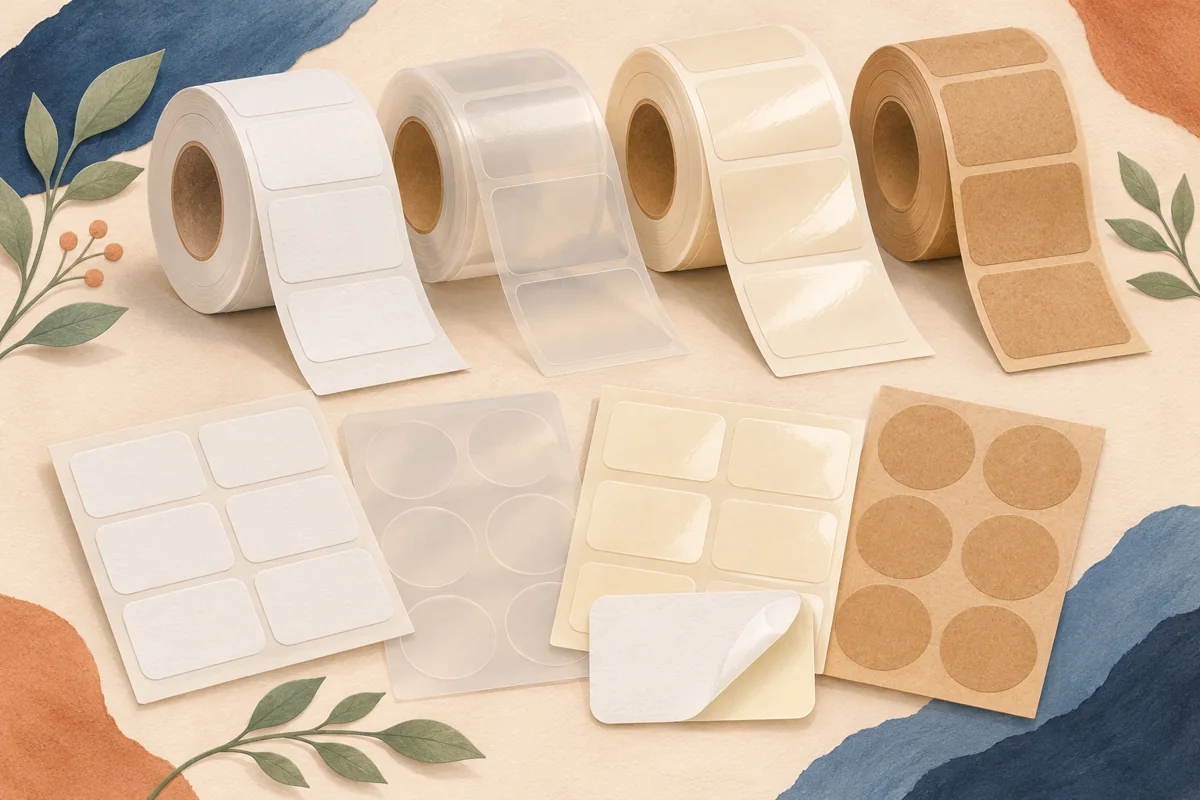
Clear and white labels solve different visual problems. A clear label lets the package and contents become part of the artwork; a white label supplies a controlled background. Choosing between them is therefore more than choosing a fashionable finish. A design that looks elegant against a white editing screen may become difficult to read on amber glass, a dark bottle or a changing product color.
01
Decide what should remain visible
Start with the customer-facing view of the filled package. Do you want to show the product through the label, keep a distinctive bottle color visible or create a strong block of brand color? Clear stock may support the first two aims, while a white label can give several different containers the same predictable visual panel. Neither choice is inherently more premium.
As a hypothetical example, imagine the same dark-blue wordmark on a clear glass bottle containing pale liquid and on an amber bottle. The text may have enough separation from one background and not the other. Print or obtain samples of both constructions. Place them together in ordinary lighting before deciding whether one artwork file can serve the whole range.
02
Check what white areas will actually print
A white patch visible in an artwork preview does not necessarily become white ink on a transparent label. Avery notes that standard home inkjet printers do not print white ink, while selected professional clear-label services offer white printing. Ask the chosen printer whether white ink or a white underprint is available and how the artwork should identify those areas.
If white printing is unavailable, think of an unprinted clear area as a window to the package behind it. Do not promise a cream background merely because the Canva page is cream on screen. You could redesign the piece for the actual transparent effect or choose an opaque white or cream label instead. Confirm the available production method before spending time on tiny color adjustments.
03
Compare a controlled panel with a changing background
White stock can help maintain the same text contrast across different bottle colors or product variants. It can also hide details you would prefer not to feature, such as an uneven viewing area behind the artwork. Clear stock can make those background differences a deliberate part of the collection, but the design has to accommodate them.
Create a small comparison sheet using the exact label size. Keep the brand name, product name and supporting wording identical between the two versions. Judge the result by recognition and readability before discussing which one feels more elegant. A fair comparison changes the label construction, not the whole type system and photograph at the same time.
| Question | Clear-label test | White-label test |
|---|---|---|
| Is the package background consistent? | Read the text on every filled variant | Check whether one opaque panel works across the range |
| Does the design need white ink? | Confirm the supplier’s process | Check the chosen white stock and printed colors |
| Is the product meant to remain visible? | Assess how much the artwork obscures | Compare a smaller opaque panel if useful |
04
Separate transparency from durability
Clear does not mean waterproof, and white does not mean unsuitable for moisture. Those decisions depend on the specified face material, coating, print and adhesive construction. Check the exact product information and printer compatibility for each candidate instead of inferring performance from the appearance of the sheet. A supplier may offer several clear materials with different intended uses.
Test the complete applied label under the handling conditions you expect. Look for edge visibility, trapped air, reflections and readability as the package moves. For containers exposed to product residue or splashes, evaluate those conditions with the supplier’s instructions in mind. A dry tabletop photograph can answer an aesthetic question, but cannot establish how the label will behave in use.
05
Approve the package as a complete design
Photograph the finished clear and white samples from the same angle with the same lighting. Read the smallest text, identify the variant and inspect the border or edge treatment. If you use a scannable code, test the finished construction against its actual background. Transparent areas behind a code need particular attention because the bottle and contents contribute to its contrast.
Save the chosen material code and approved artwork together. If you later change the bottle color or product appearance, reopen the decision rather than assuming the label still works. A clear-label design is connected to the surface behind it; an opaque panel gives more control, but its finish and print still deserve a new proof after a material change.
BEFORE YOUR NEXT STEP
Your practical checklist
- Compare clear and opaque samples on filled containers.
- Confirm white ink or underprint capabilities before designing for them.
- Check the smallest text against every background.
- Choose durability and printer compatibility separately from appearance.
- Repeat the proof when the bottle or product color changes.
Questions & answers
Can my home printer print white text on clear stickers?+
Do not assume so. Standard home inkjet printers generally do not provide white ink. Check your printer and ask a professional supplier about white printing if the design depends on it.
Are clear labels always waterproof?+
No. Transparency describes appearance, not the complete material’s durability. Check the specific stock, print process, adhesive and supplier guidance.
Can one design work on both clear and white labels?+
Sometimes, but compare actual proofs. Background color, unprinted areas and contrast may require separate artwork versions.
Sources & further reading
Official references for the technical points in this guide. Check current specifications before production.