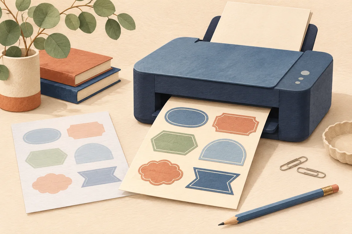
A navy border can look rich on a laptop and lighter on a printed label. An ivory background can seem warm on one device and almost white on another. Those differences do not automatically mean the artwork file is broken. Screens, printing processes, label materials and viewing light all contribute to the result. The practical goal is an approved physical color reference for your packaging, not a promise that every screen will show exactly the same thing.
01
Separate the screen preview from the print specification
A screen emits light, while a printed label is viewed by reflected light. Canva’s print-color guidance explains that moving from screen-oriented color to a print process can change the appearance of colors. The exact result also depends on the chosen output workflow. A color that looks vivid on a bright display may not have an identical printable equivalent in the process you are using.
Ask the print provider which file type and color setup they need before exporting. If a particular export option is unavailable in your Canva account, describe that limitation and ask what they can accept. Do not assume that selecting a color mode alone guarantees a match. A complete specification and a physical proof are more useful than repeatedly moving a color picker until two different screens look similar.
02
Treat the label background as part of the palette
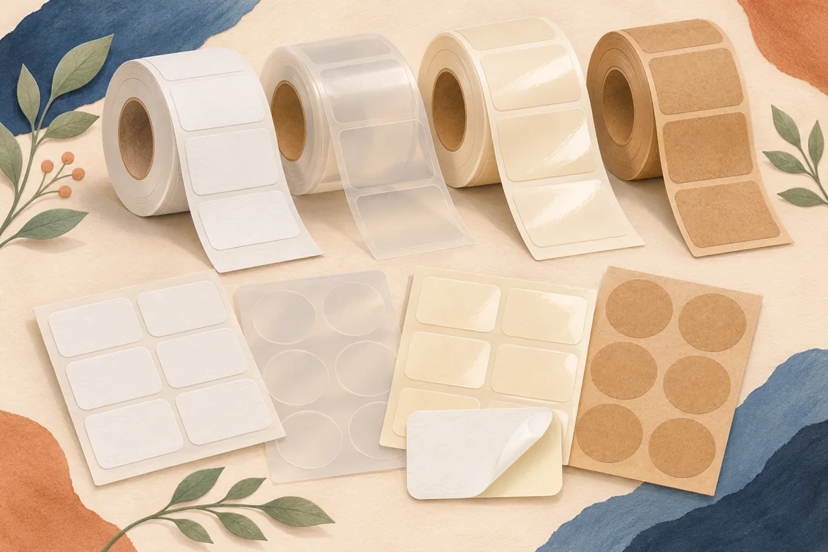
White, ivory, kraft and transparent materials create different foundations for the same artwork. On clear stock, the bottle or contents behind the label can contribute to the apparent color. A white design preview is therefore not a reliable substitute for the final package. Decide which exact material will carry the design before approving delicate contrasts or very pale tones.
For a hypothetical navy-and-cream soap label, compare one proof on the intended white stock and another on a proposed ivory stock. Keep the artwork file and print settings identical. Ask whether the difference you see is useful for the brand or whether you need a separate artwork adjustment. Record the chosen stock code so that the next batch is not printed on a visually similar substitute without review.
03
Make a small controlled color test
Create a proof that includes the actual product name, smallest text, fine artwork and any large color area. You can also add a small set of clearly identified candidate swatches beside the design. Change one relevant variable at a time, such as the navy shade, and keep the other decisions stable. This turns an uncertain visual discussion into a comparison you can repeat.
Suppose the original navy loses definition on the chosen paper. Print the original and two nearby alternatives in the same proof job. Compare the text and border at finished size, not just the swatches. Pick the combination that communicates the design clearly. A dark color should still permit useful contrast and detail; choosing the numerically darkest candidate is not a substitute for checking the whole label.
| Keep constant | Change deliberately |
|---|---|
| Printer, stock and file scale | One candidate artwork color |
| Lighting and viewing distance | One contrast or border treatment |
| Label wording and dimensions | One export workflow agreed with the printer |
04
Review under a repeatable light source
Inspect the proof where you can compare it without strong colored reflections. Then check the package in its expected display environment. The first view gives you a consistent reference; the second checks the actual use. Avoid judging one sample beside a sunny window and another under a warm lamp, because a change in viewing conditions can be mistaken for a change in print.
A photograph of a proof is useful for recording the design, but it is not a dependable color standard on its own. The camera, editing and the viewer’s display introduce more variables. Keep the physical approved sample if color consistency matters. If several people are approving the artwork remotely, agree which print sample or provider proof represents the decision rather than relying on separate screenshots.
05
Save the approval conditions with the artwork
Record the final file version, label material code, printer or supplier and relevant export instructions. Keep the approved physical sample and a package photograph together. When the color is intentionally revised, create a new approved version instead of silently replacing the old export with the same file name. That makes repeat orders and supplier conversations more precise.
If a later batch looks different, compare its construction and production record before redesigning the palette. Was the material changed? Was a different file used? Did the provider change the output process? Use those questions to identify the cause. A stable approval workflow will usually be more valuable than continually adjusting artwork to match whichever device happens to be in front of you.
BEFORE YOUR NEXT STEP
Your practical checklist
- Get the printer’s file and color requirements.
- Proof on the chosen label stock and actual package.
- Compare only one deliberate change at a time.
- Use consistent lighting for approval.
- Keep an approved physical sample and production record.
Questions & answers
Will a CMYK export make the print match my screen exactly?+
No. It may be part of the printer’s required workflow, but screens, stock and print processes still differ. Approve a physical proof rather than promising an exact screen match.
Should I redesign the colors when a phone preview looks different?+
First compare the actual exported file and approved print reference. A device preview alone does not establish that the print artwork needs changing.
Can I approve color from a photo sent by a printer?+
Use the photo to discuss layout and obvious issues, but recognize its limitations for exact color. Ask what physical proof or color reference is available when consistency is important.
Sources & further reading
Official references for the technical points in this guide. Check current specifications before production.