A cold brew range can include a drink and a concentrate in bottles that look almost identical. Attractive matching labels are only useful if the customer can tell those formats apart. Establish the product type and its verified directions first, then fit the label to the assembled bottle and compare the range as a customer would encounter it.
01
Start with the product-format distinction
Make a short copy sheet for each item containing the approved name, format description and any directions supplied by the business. Confirm that a concentrate is identified as such wherever it appears. Avoid letting a flavor name occupy the only prominent space while the important format difference is hidden on the back.
For an illustrative pair, a ready-to-drink Original and an Original Concentrate may share the same main color. Compare adding a clearly written format line with using only a darker background. Ask another person to identify the intended item without explaining your color scheme. Treat the response as a usability observation, not a sales result.
02
Find the bottle’s actual label panel
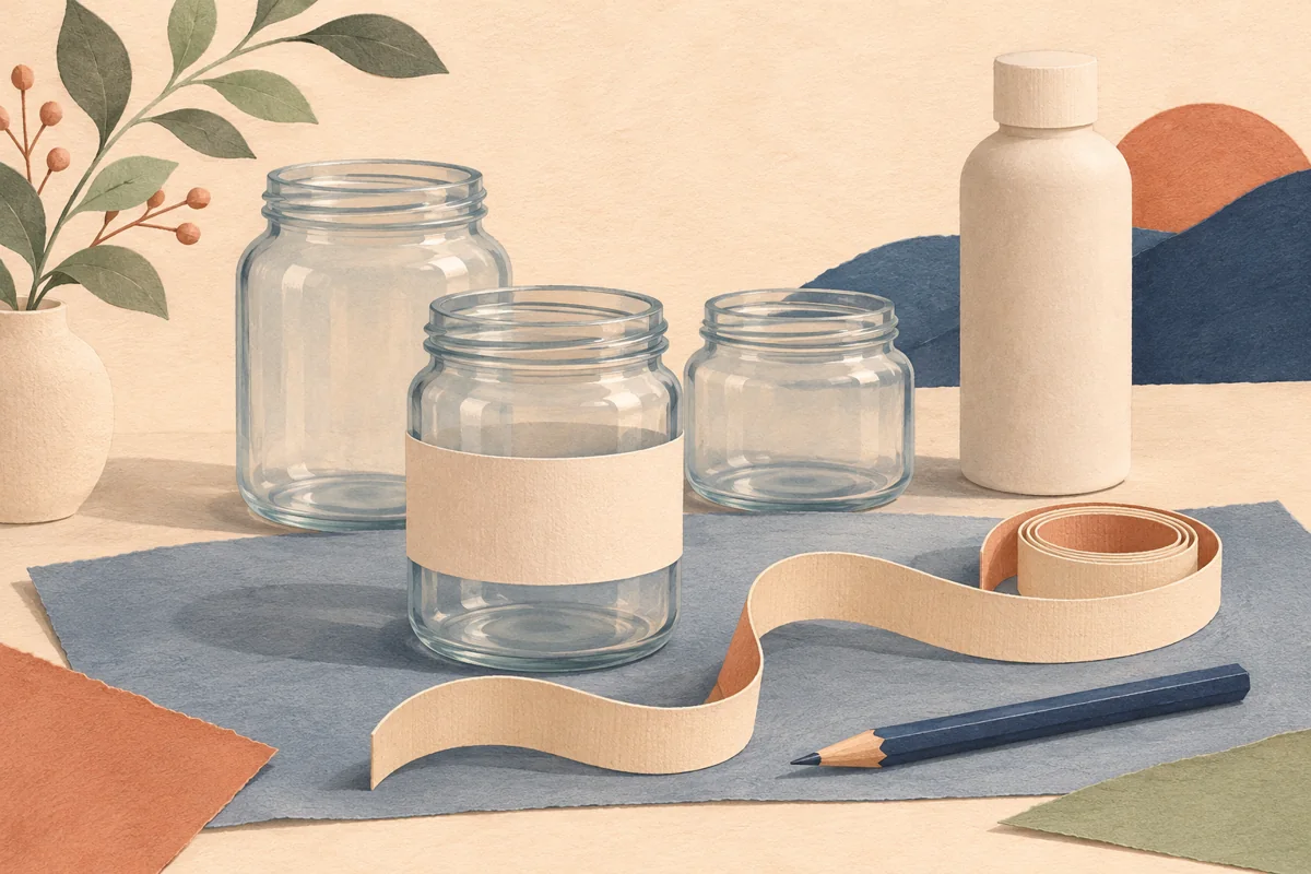
Measure the filled-pack silhouette with its closure attached and mark the stable body area. Berlin Packaging’s decanter example has a distinct panel between decorative body features, illustrating why the outside bottle details matter. Do not transfer that model’s panel or dimensions to another bottle.
If the pack has a handle, grip recess, broad shoulder or tapered wall, include it in the paper proof. A front label can be readable while a wrap creases around a changing diameter. Compare separate front and rear panels when a single wrap places important text on an awkward curve.
| Copy or feature | Check on the sample |
|---|---|
| Product format | Visible beside the name |
| Serving directions | Readable maker-approved wording |
| Body texture | Label remains on the usable panel |
03
Lay out directions without inventing a recipe
Use only serving information approved for the actual product. If the concentrate has a specified preparation method, keep the quantity, units and sequence together so the reader does not have to combine fragments from different panels. Do not invent a dilution ratio for a packaging demonstration.
Proof the instructions independently of the decorative artwork. Check that the words in the label, product listing and any accompanying card describe the same format. If a bottle size changes, ask the maker to reapprove the wording rather than assuming a quantity or instruction should scale automatically.
04
Check condensation and release the complete set
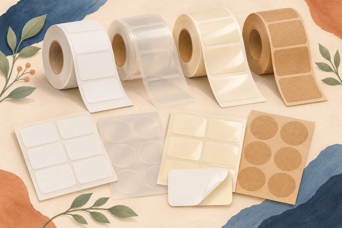
Discuss the expected application and handling conditions with the label supplier, then obtain an appropriate printed material sample. Inspect the complete print, finish and adhesive on the actual bottle under the business’s normal handling process. A film name by itself does not validate every part of the finished label.
Photograph the approved drink and concentrate side by side, including the rear panels. Save the bottle reference, artwork revision and print-stock details with that image. Preview the available editable coffee or beverage layouts for a visual starting point, then check their actual format against the package rather than assuming a dedicated cold brew collection is included.
BEFORE YOUR NEXT STEP
Your practical checklist
- Make drink and concentrate wording explicit.
- Use a measured bottle panel.
- Obtain approved directions without altering the recipe.
- Compare the finished variants together.
Questions & answers
Should the concentrate always use a different color?+
Color is an optional supporting cue. A clear written format description remains useful even when a shopper cannot distinguish the accent colors.
Can one label size fit every cold brew bottle?+
Bottles with similar capacities can have different shoulders, textures and straight-wall heights. Repeat the panel measurement and paper proof for each model.
Sources & further reading
Official references for the technical points in this guide. Check current specifications before production.