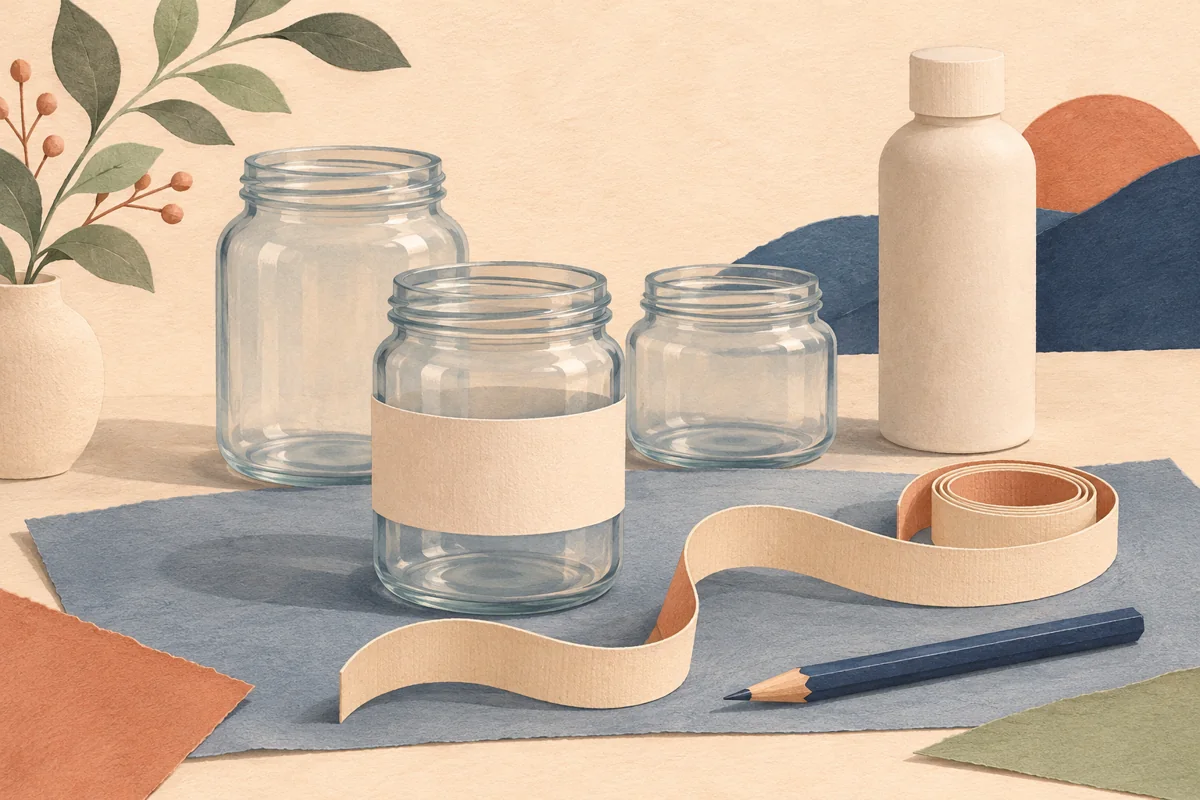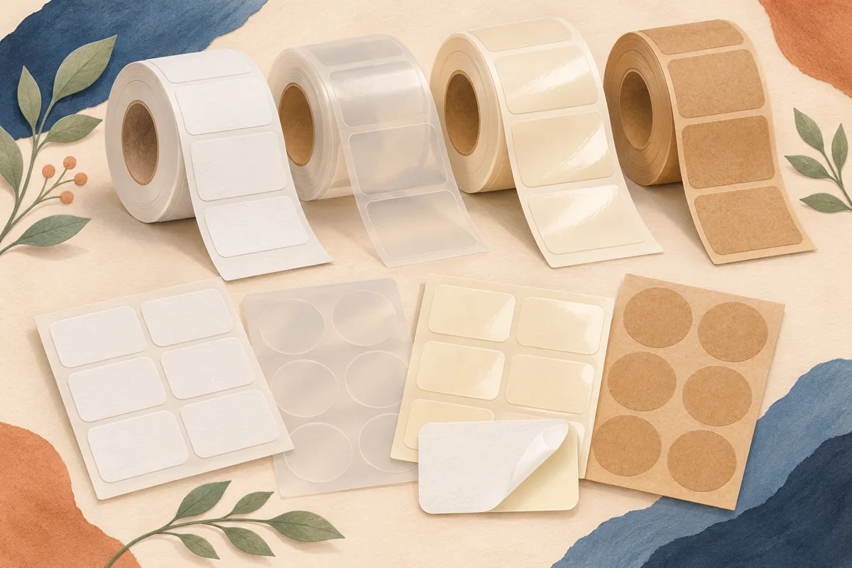
Embossing adds a raised physical detail to a label. It is most useful when that detail has a clear role in the design, such as identifying the maker or giving a simple emblem texture. Planning the effect begins with what the customer should notice, rather than with the number of elements you can raise.
01
Choose the element by its tactile purpose
Draw a simple map of the label with three zones: the product identity, supporting wording and the proposed raised detail. A raised maker emblem can create a focal point without turning every line into a production constraint. Keep the scent, flavor or size easy to identify in ordinary printed text.
Imagine a honey label with a bee emblem above the variety name. One sample could raise the bee while a second raises a small circular frame. Keeping the remaining artwork unchanged makes it easier to compare those tactile ideas. These are illustrative design trials, not a claim that either finish has been tested on a particular jar.
02
Ask about the substrate and the tool together
Blue Label describes embossing as a way to raise logos, imagery or patterns. The achievable result depends on the printer’s process and the selected stock. Ask for a material sample carrying an emboss comparable to your proposed detail, rather than judging an unprinted paper swatch alone.
Discuss small gaps, narrow strokes and closely spaced letters before preparing the final file. Use the supplier’s own minimums. A tool that works on one paper and design may not produce the same definition on another. If a detail must change, request a revised visual reference that you can approve.
03
Plan a version that remains readable
Separate essential product information from decorative texture. A raised pattern can sit behind or beside the main identity, but it should not make the text difficult to inspect. Check the ordinary printed version first, then ask whether the tactile area introduces a conflict.
For the example honey label, compare a plain brand wordmark with an embossed bee. Do not add a second raised border until the first choice has been reviewed. Fewer effects make the approval conversation clearer and leave more room for the variety name.
| Feature | Question for the printer |
|---|---|
| Raised emblem | Will small internal gaps remain distinct? |
| Raised wordmark | Which stroke widths need adjustment? |
| Raised pattern | How does it affect nearby printed wording? |
04
Keep a physical approval reference
A digital mockup can indicate where an emboss belongs, but it cannot reproduce its height or feel. Review the finished sample on the container, including how the package sits beside other variants. Check whether the label can be handled and applied through your actual packing routine.
Keep the supplier’s final artwork identifier, tooling reference if provided and approved stock specification together. When reordering, confirm whether a size change requires new preparation. A reusable Canva design can organize your visual identity; it does not supply embossing equipment or guarantee a compatible print file.
BEFORE YOUR NEXT STEP
Your practical checklist
- Choose one raised focal point.
- Confirm material and tooling compatibility.
- Review adjusted strokes and internal gaps.
- Retain the approved physical example.
Questions & answers
Is an embossed-looking shadow the same as embossing?+
No. A shadow can illustrate depth on screen, while embossing changes the physical surface through a production process.
Can I move an approved emboss to a smaller label?+
Ask the printer to review the resized detail. Scaling can change the relationship between strokes, gaps and the tooling requirements.
Sources & further reading
Official references for the technical points in this guide. Check current specifications before production.