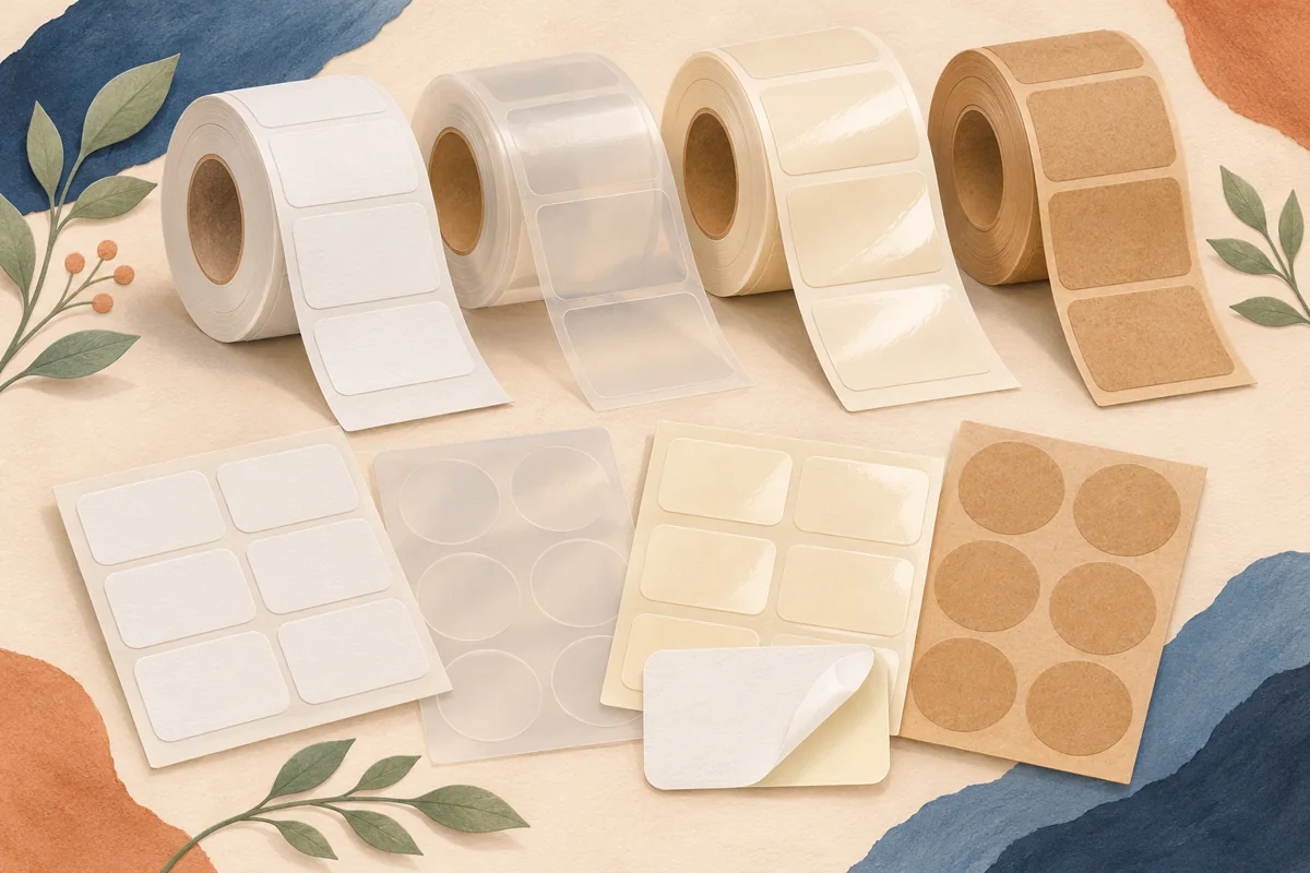
Matte and glossy finishes can make the same label feel different, but choosing a finish from a close-up stock photograph leaves important questions unanswered. Will the small text remain readable under your display lighting? Does the product photograph well? Is the chosen print and material combination suited to handling? This guide gives you a comparison method for choosing the finish rather than declaring one finish best for every handmade brand.
01
Keep finish separate from the rest of the construction
Matte and gloss describe surface appearance, not every property of a label. A matte paper and a matte film may be very different products, just as two glossy stocks can use different adhesives or print processes. Decide which constructions meet your practical needs first, then compare the finish among suitable candidates. This keeps an attractive sample from winning a comparison it was never qualified to enter.
Make a short candidate sheet containing supplier product code, printer compatibility, material, adhesive and finish. If one option is paper and another is film, note that difference explicitly. Your decision may involve more than shine, and recording those details helps when a replacement stock is suggested later. Ask the supplier which options suit your package surface and expected handling.
02
Read the artwork under real lighting
Avery’s finish guidance highlights the way matte and glossy surfaces interact with light. Use that as a reason to inspect actual samples, not as a promise that one choice always reads better. Hold the package under the kind of shelf, market-stall or room lighting in which a customer will see it. Tilt it slowly and watch what happens to the product name and supporting text.
For a hypothetical balm tin, print the same dark name and small instruction block on two suitable finishes. Put both tins in the same position under a desk lamp and then in indirect daylight. If one treatment creates a reflection that hides a key word, try adjusting the design or position before rejecting the finish entirely. Record which combination remains comfortable to read.
03
Compare photographs as well as physical samples
Your label may be encountered first in a small product image. Photograph both finishes with the same camera position, background and light direction. Check the full-size image and a small thumbnail. A reflection that seems minor while you hold a package can cover the brand name in a listing photo, while a very quiet surface may need more deliberate contrast to communicate at small scale.
Keep the edit treatment consistent between comparison photographs. Do not brighten one image, deepen its colors and sharpen the wording while leaving the other untouched. If the glossy sample needs a different light setup to photograph well, record that practical requirement. The right choice includes the photography workflow you can repeat for future variants.
| Comparison | What to inspect |
|---|---|
| Package held normally | Product name and supporting text remain readable |
| Package under display lighting | Reflections do not hide essential wording |
| Small listing photograph | Identity and variant are distinguishable |
| Printed scannable code | Actual scans succeed on the finished package |
04
Check handling without inventing performance claims
Use finished labels prepared according to the supplier’s instructions. Handle the packages normally and compare the surfaces with an untouched control. Look for visible marks, print transfer or changes at the edges. These observations help you choose between the specific constructions you tested; they do not establish a general rule about every matte or glossy label.
If the package will encounter splashes, oils, wiping or refrigeration, ask about those conditions directly and test the exact label construction for the intended use. A glossy appearance is not proof of waterproofing, and matte does not automatically mean ordinary uncoated paper. Keep the supplier specification, application directions and actual use conditions together in the approval record.
05
Choose a finish for the range, with exceptions if needed
Place all the variants together before approving the finish. Pale artwork, a dark block of color and a large botanical illustration may respond differently even when printed on the same stock. Check the most demanding label as well as the easiest one. A finish that works beautifully on a large front panel may require a simpler design on a tiny lid sticker.
Save the exact material code and approved export, then photograph the complete package as the reference for future runs. Keep exceptions intentional: perhaps a gift sticker uses a different finish because it has a different role. A coherent brand does not require one universal stock, but every change should be a documented choice rather than a substitute discovered only when the next batch arrives.
BEFORE YOUR NEXT STEP
Your practical checklist
- Compare suitable constructions, not just the finish names.
- Use the same artwork and package for both samples.
- Inspect physical readability and listing photographs.
- Test codes on the final label if included.
- Record the chosen material code and photography setup.
Questions & answers
Are glossy labels more premium than matte labels?+
That is a design judgment, not a rule. Compare the finish with your artwork, package and desired presentation, then check that the important wording remains readable.
Does gloss make a label waterproof?+
No. Check the specified material, coating, print and adhesive construction. Surface shine alone does not establish water resistance.
Can I mix matte and glossy labels in one collection?+
Yes, if the choice serves a clear packaging role and the overall range remains coherent. Make the difference deliberate and keep a record of the approved specifications.
Sources & further reading
Official references for the technical points in this guide. Check current specifications before production.