Matching pumps can make a sink look tidy, but they also make it easy to reach for the wrong bottle. Soap dispenser labels should answer a practical question at a glance. If one bottle holds hand soap and another holds dish soap, put those words where someone can see them while standing at the sink. Then check that the label fits the filled bottle, reads under the room’s lighting and holds up to the splashes and wiping it will encounter.
01
Give every refill bottle a clear identity
Write the contents in words people in the household or studio already use. For a pair of identical kitchen pumps, “Hand Soap” and “Dish Soap” are more useful than two decorative names that require someone to remember which is which. A scent name can sit on a second line when it helps distinguish refills. Reserve the strongest visual emphasis for the words that guide the choice.
If bottles often move during cleaning, test them after switching positions. Read both names while standing in the usual spot at the sink. A simple icon or color cue can support the words, but the design should still work when those cues are difficult to see. Change the label when a dispenser’s contents change.
02
Measure the part of the bottle that faces forward
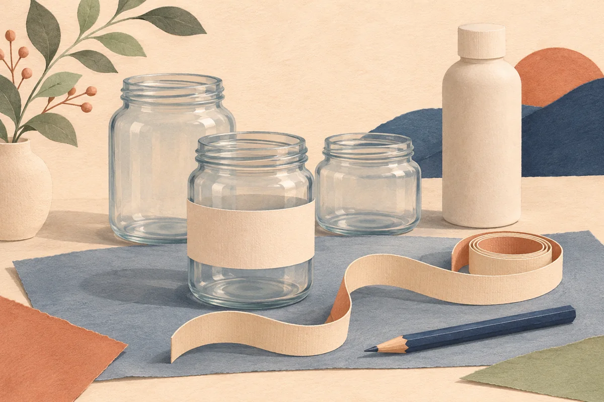
Stand the filled dispenser where it will be used and turn the pump to its normal position. Measure the usable face between the shoulder, base curve and any molded details. Tape a paper rectangle to the bottle and view it from the side. If the corners ride up on a curve, try a smaller rectangle or a shape that better suits the face.
In a hypothetical example, the flat-looking panel is 62 mm wide and 80 mm tall. A 52 by 64 mm paper trial leaves 5 mm on each side and 8 mm above and below when centered. Those margins only describe this example. Check the actual fit and compare it with the dimensions of any editable layout you plan to use.
| Example measurement | Result |
|---|---|
| Usable front panel | 62 mm wide × 80 mm tall |
| Trial label | 52 mm wide × 64 mm tall |
| Centered clearance | 5 mm at each side and 8 mm above and below |
03
Proof the text under the light above the sink
Print the trial at its intended size. Look at the name from your normal reach and check the second line if you need it to identify a refill. For example, mark a position 60 cm from the bottle and use that same distance for two proofs. Try dark lettering on an opaque background if an amber bottle or changing liquid color makes transparent artwork harder to read.
Use the overhead light as well as daylight. Move the pump slightly and see whether a reflection covers any letters. Simplify decoration before reducing the name to fit. If two bottles remain easy to confuse, increase the distinction between their main words or give each one a more obvious supporting mark.
04
Compare finished labels through a wet-sink test
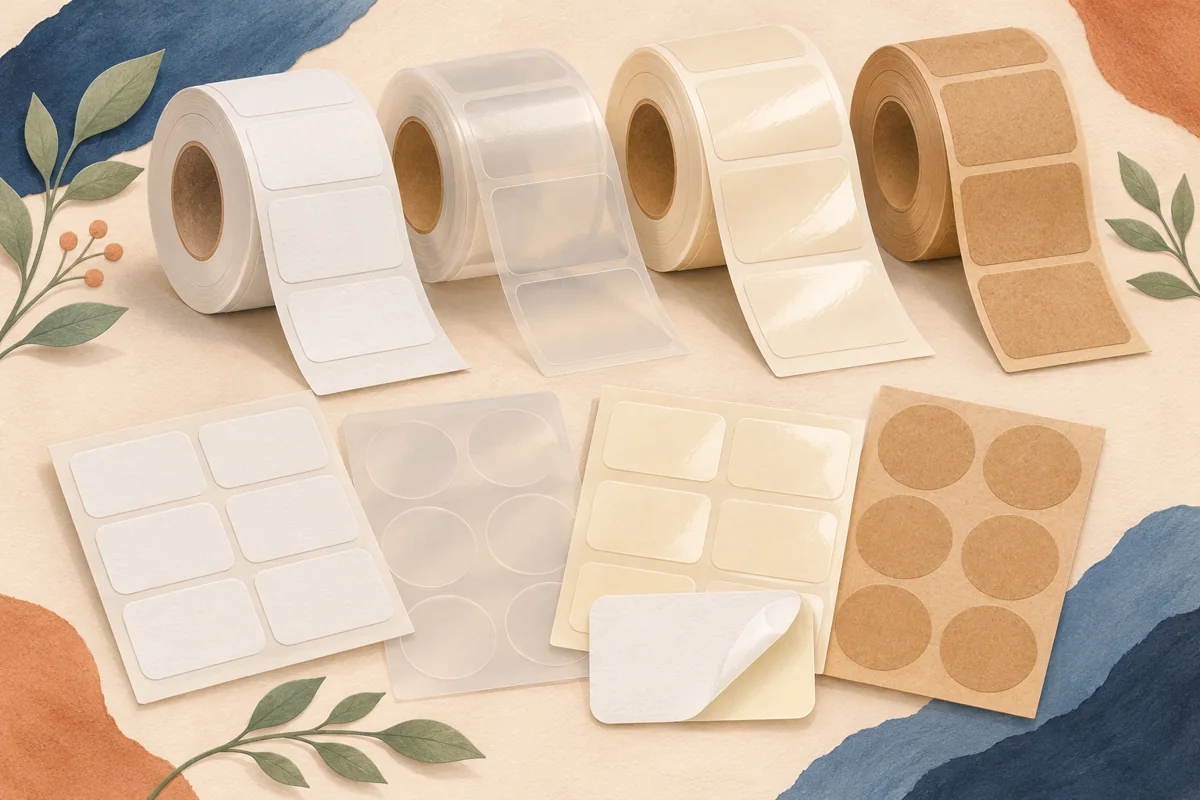
Check supplier guidance for the stock, adhesive and print process. Avery distinguishes materials suited to occasional splashes from those intended for longer or more frequent water contact. The result depends on the whole label construction. Choose candidates compatible with your bottle surface and printer or order finished samples from your supplier.
Apply two candidate labels to identical clean, dry bottles as directed and allow any recommended setting time. Photograph both before use. In a simple comparison, give each bottle the same twenty damp-cloth wipes over two days. Compare edge lift, smearing and text readability at your chosen distance. This checks your intended routine. Formal durability claims require the supplier’s own specifications.
05
Keep a repeatable setup for refills
Save the bottle model, label dimensions, material code and approved artwork together. Keep a spare printed label for each dispenser so a damaged one can be replaced quickly. If you switch bottle material, finish or size, make a new paper proof and repeat the handling comparison. Matching pump heads alone do not establish that the same label will fit or adhere.
BEFORE YOUR NEXT STEP
Your practical checklist
- Name the contents in plain words.
- Check a paper mockup on the filled dispenser.
- Read each label at the same distance and in the same light.
- Compare stock and print on the actual surface.
- Save the approved size and material code for replacements.
Questions & answers
What size should a soap dispenser label be?+
Measure your dispenser’s usable front panel and try a paper shape. Different bottles of the same capacity can have different curves and flat areas.
Can a Canva soap layout be used for a pump bottle?+
Check its actual dimensions and artwork first. A layout intended for a bar or box may need a different shape or reading order for a dispenser.
Sources & further reading
Official references for the technical points in this guide. Check current specifications before production.