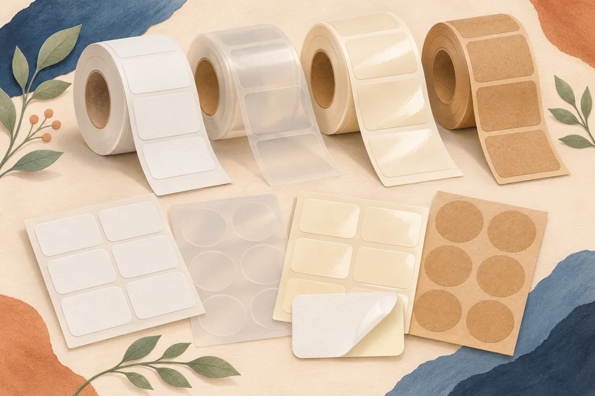
A tactile paper label may be part of the character of a bottle or jar, even when that package will be chilled. Wet-strength papers offer another option to investigate before replacing every paper design with film. The useful question is how the particular printed construction behaves in your actual moisture conditions.
01
Describe the exposure in practical terms
Write down whether the package is occasionally handled with damp hands, chilled before display or expected to sit in a wet environment. Include the approximate sequence and duration you actually plan to use. Words such as premium paper or moisture-resistant stock are too broad to replace that description in a supplier conversation.
For an illustrative bottled mixer, compare a refrigerated bottle brought to a counter with a bottle displayed in a wet container. Those situations can create different exposure at the label edge and face. Do not assume a material recommended for brief condensation has also been approved for the longer or more demanding display.
02
Separate paper strength from the rest of the build
Blue Label Packaging distinguishes wet-strength paper from waterproof material. Ask the printer which paper, adhesive and protective treatment it proposes for your stated use. The ability of the paper to remain coherent does not tell you whether the printed name resists rubbing or whether the adhesive stays bonded to the chosen glass finish.
Also ask how a coating or laminate changes the intended tactile appearance. A protective finish may make a sample feel different from the unprinted swatch that first attracted you. Request a printed example with representative coverage so the selection is based on the completed label rather than only the paper’s dry texture.
| Component | Separate observation |
|---|---|
| Paper face | Texture, softening and edge appearance |
| Print and finish | Readability and surface marking |
| Adhesive bond | Lifting, movement or bubbles on the bottle |
03
Compare dry and exposed samples side by side
Prepare matching bottles with the same artwork dimensions and application position. Keep one dry control and expose another through the intended display sequence, following the supplier’s instructions. Photograph the labels at comparable angles and lighting. This helps distinguish a genuine surface change from reflections or an unrelated application difference.
Review the smallest type, any fine illustration and the corners after the chosen handling stage. Record the exposure and what you saw without turning a small comparison into a universal performance rating. If an edge problem appears while the paper remains sound, bring that specific evidence to the provider instead of simply requesting thicker paper.
04
Preserve the look through the final proof
Once a construction is selected, proof the artwork on that exact stock. A textured or warm-toned paper can change the way subtle colors and delicate lines appear. Keep the approved physical example with the job reference so a later reorder can be compared with the original result rather than a screen image.
Choose an editable label layout with enough contrast and space for the real wording, then personalize it for the measured bottle panel. The digital template does not include wet-strength paper or establish a moisture rating. Ask the printer to confirm the final construction whenever the intended display, paper, coating or adhesive changes.
BEFORE YOUR NEXT STEP
Your practical checklist
- Describe the real moisture sequence.
- Separate paper, print and adhesive checks.
- Keep a dry comparison sample.
- Approve artwork on the exact finished stock.
Questions & answers
Is wet-strength paper the same as waterproof paper?+
No. Ask what exposure the specific construction supports. A wet-strength paper recommendation should not be extended to long soaking or another untested use.
Can I judge the result from an unprinted swatch?+
A swatch shows texture and base color. A useful production decision also needs representative printing, finish, adhesive and a sample on the intended container.
Sources & further reading
Official references for the technical points in this guide. Check current specifications before production.