A small beard oil bottle gives you a narrow front view and a curved wall that carries words out of sight. Make the product type and scent easy to recognize before adding decorative details. Then check where the label sits when someone opens the dropper.
01
Mark the front that a shopper can actually read
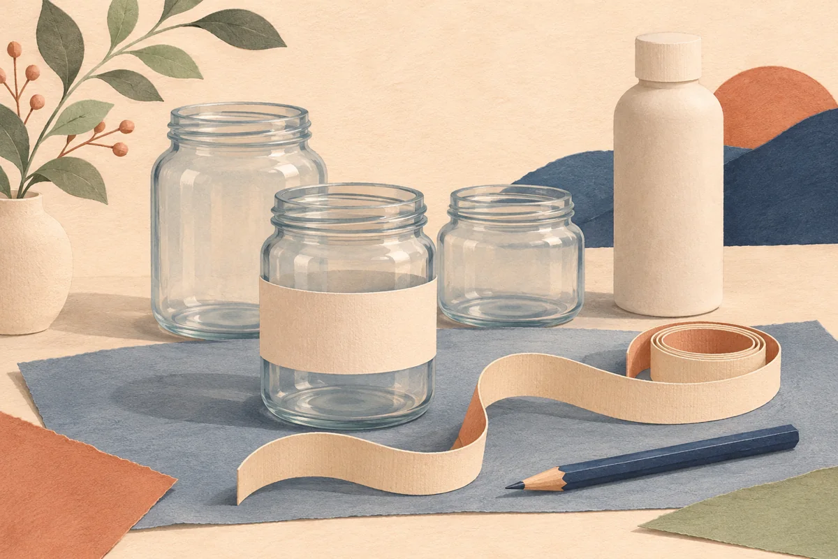
Wrap a paper strip around the closed bottle and mark the straight area between the shoulder and base. Hold the bottle in front of you and mark the left and right points where lettering begins to curve away. That front-facing window is more useful for the product name than the full circumference.
For example, a trial bottle might allow a 36 mm high label but only a 25 mm wide front identity area. Draw those two boundaries on a paper proof. Keep the product type and scent within the narrow window, and use the remaining wrap for supporting information.
02
Compare two panels with one short wrap
Separate front and back labels can keep each block compact, while a wrap gives you one piece to apply. Try both on the same model. Look at the front, turn it to read the back and see whether the gap or join sits neatly out of the main view.
If you choose a wrap with overlap, confirm the overlap allowance and artwork instructions with the supplier. Keep small words clear of the join. Do not place a decorative vertical border where even a slight application shift would make the seam look crooked.
| Layout | Main advantage to test | Fit detail |
|---|---|---|
| Separate panels | Compact front and readable supporting block | Even alignment between both pieces |
| Short wrap with gap | One piece with a clearly defined front | Gap remains outside the identity area |
| Wrap with overlap | Continuous artwork around the bottle | Approved stock and a clear join allowance |
03
Check contrast on amber glass
A transparent background can change with the bottle color and fill level. Print a proof on the intended stock and review it against both the filled bottle and the visible glass above the liquid. An opaque area behind the words can give more consistent contrast.
Keep fine scent names and decorative botanical lines separate from the small information block. Photograph the bottle in the lighting you use for the shop. If a bright reflection obscures the name, adjust the light and bottle angle before deciding whether the print needs a change.
04
Review handling and reorders
Open and close a sample and note where the hand grips it. Ask the supplier about the expected oil contact, bottle material and complete print construction. Test those conditions on a sample, keeping one untouched label beside it for comparison.
Save the approved bottle model, label dimensions and file with a front and rear photo. Check the text for the specific product before printing. When choosing editable Canva artwork, compare the available formats with the measured panels and confirm any resizing needed for your bottle.
BEFORE YOUR NEXT STEP
Your practical checklist
- Measure the straight wall and front view.
- Compare separate panels with a wrap.
- Check text against the bottle color.
- Test the complete label under expected handling.
Questions & answers
Can one beard oil label fit every dropper bottle?+
Measure each model. Similar capacity can come with different shoulder shapes and straight wall heights.
Should I use transparent labels?+
Use a physical proof on the filled bottle to decide. Dark glass can make some lettering difficult to read without an opaque backing.
Sources & further reading
Official references for the technical points in this guide. Check current specifications before production.