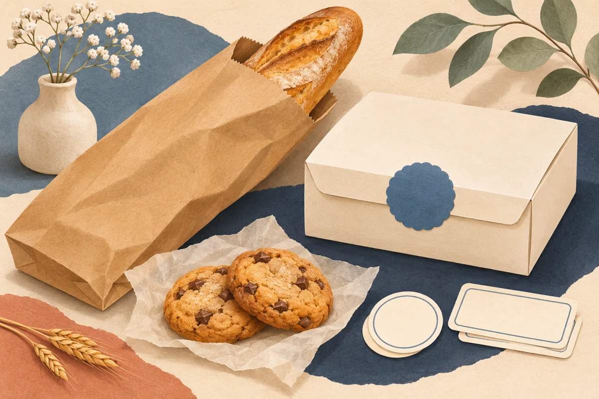
A flat lay is useful when you want to show several packaging pieces together. Label artwork, a box and a finished product can share one overhead view, but a busy arrangement can make the contents difficult to understand. Decide whether the image explains the collection or creates an atmosphere before placing props.
01
Choose the question the arrangement will answer
A collection overview should make the number and relationship of its pieces understandable. A texture image can focus on the printed stock and surface. Write the intended answer in one sentence before building the scene so you can remove objects that do not help.
For an illustrative bakery-label image, the useful pieces might be a label sheet, a closed cookie carton and one separate label proof. A rolling pin can suggest context, but it should not push those three pieces out of the center. Keep the visual story aligned with what the linked page explains.
02
Build around a clear main object
Place the largest or most informative item first, then add smaller pieces around it. Leave a gap where a border, product name or label shape needs to be seen. Avoid overlapping the exact area a buyer is trying to compare.
Check the height of each item before taking the overhead frame. A tall jar beside a flat sheet introduces depth and shadows. If the jar dominates, try a lid or an empty matching carton instead, or move the taller piece into a separate detail shot.
03
Balance the arrangement without filling every gap
Try an orderly grid when the goal is to compare formats. For a softer scene, place the main object on a slight diagonal and let two supporting items repeat that direction. Both approaches work better when the eye has a clear starting point.
Take a phone preview of the layout before refining small decorations. If the objects blend into a single pattern, remove one prop or increase the spacing. A clean background often gives the label artwork more room to establish the brand.
| Image purpose | Arrangement to test |
|---|---|
| Compare formats | Consistent gaps and visible label outlines |
| Show a coordinated set | One main piece with matching supporting packs |
| Explain printing | Proof, label sheet and finished application together |
04
Check the camera angle and final context
Keep the camera square to the surface so rectangular labels retain their shape. Review the far corners of a printed sheet for distortion and soft focus. Use a stable support if you need to repeat the angle across several photographs.
Before publishing, add any necessary explanation of digital templates, printed examples or props in the listing. A flat lay can imply a bundle through proximity. Make the visible image and the written contents agree so the customer knows what they will receive.
BEFORE YOUR NEXT STEP
Your practical checklist
- Choose one purpose for the image.
- Place the main label before the props.
- Check overhead alignment and corners.
- Describe included items accurately.
Questions & answers
Should every object be fully visible?+
Show the objects necessary to understand the offer. Partial decorative props can work when they do not obscure label details or confuse the contents.
Can I use the same arrangement for several products?+
Repeat the camera and light position, then adjust spacing for the actual shapes. A new package may need a different balance.
Sources & further reading
Official references for the technical points in this guide. Check current specifications before production.