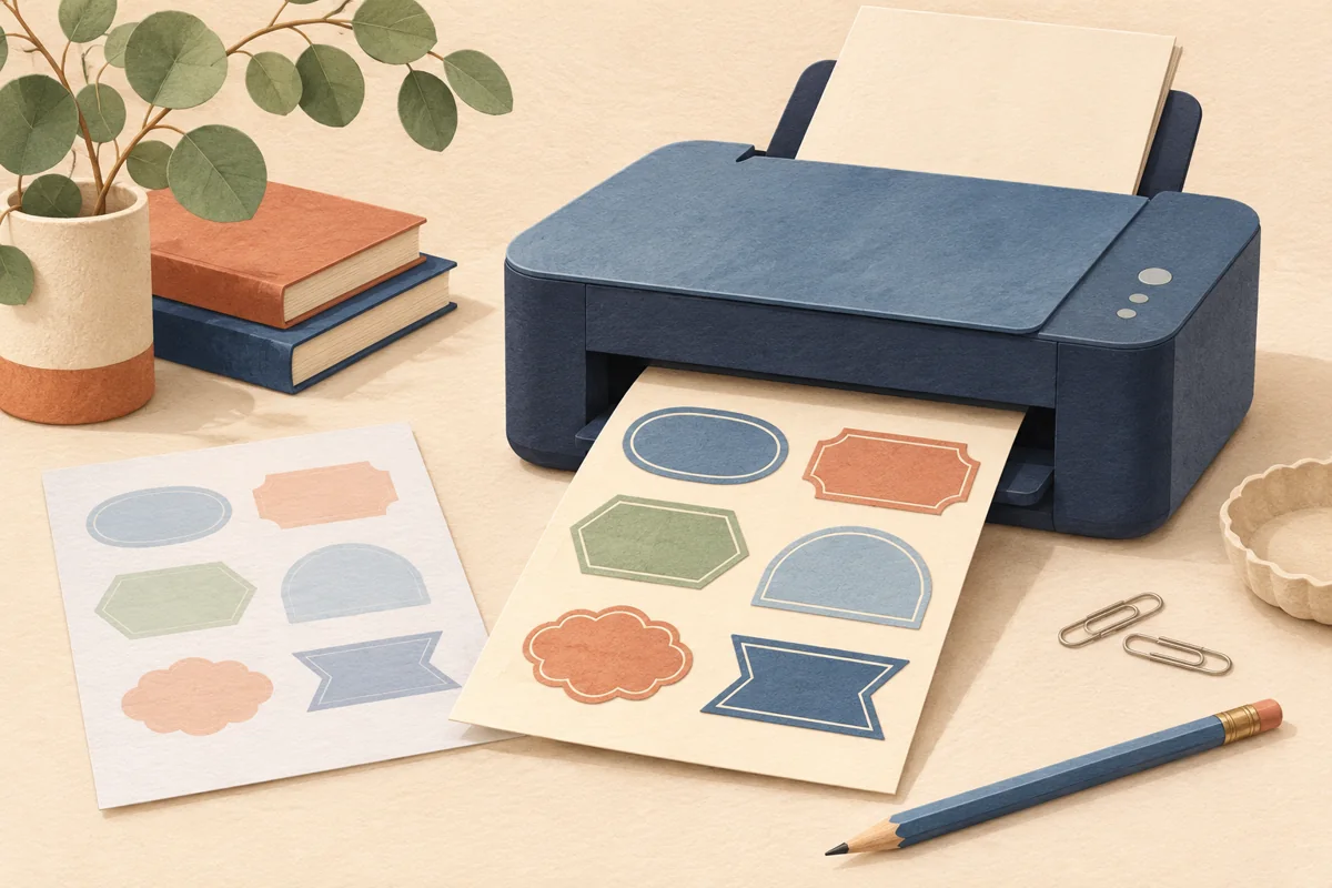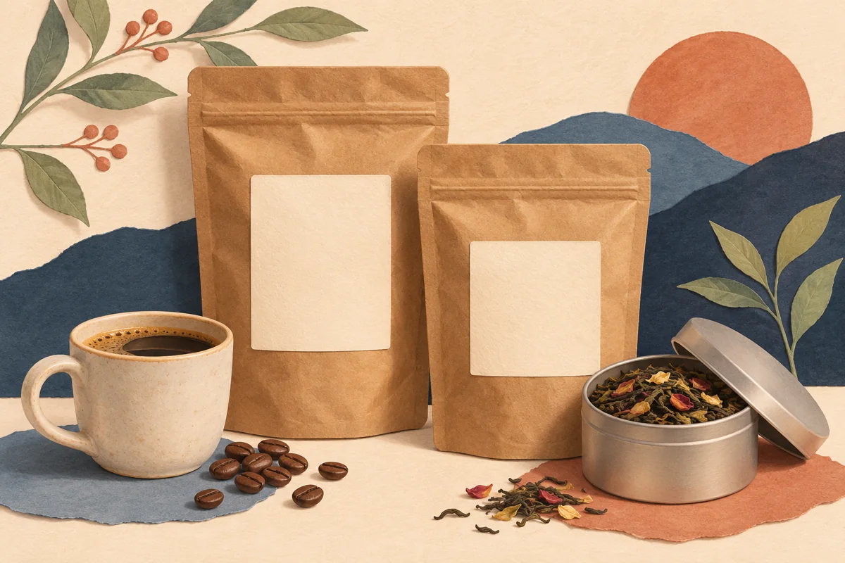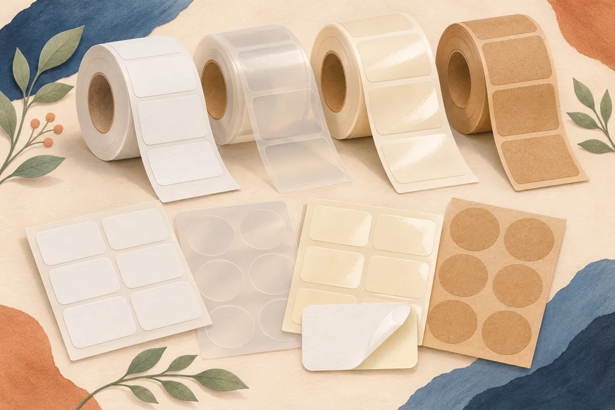
Brown kraft labels bring a visible paper color and texture into a design. That background can suit bakery bags, tea pouches and handmade gift packaging, but it also changes how artwork is perceived. The useful question is not whether kraft looks natural. It is whether your chosen wording, colors and decorative details remain clear when printed on the exact brown stock you intend to buy.
01
Start with the actual shade of brown
Kraft is a material description, not a single digital color. Compare samples of the exact paper you may order against the package. A light brown sticker on a dark pouch creates a different effect from a similar-toned sticker on a kraft box. Decide whether the label should blend into the packaging or create a distinct readable panel.
For a hypothetical tea pouch, place two blank kraft samples beside the filled bag and the planned navy type color. Choose the candidate that gives the product name enough separation. Then print the name and a short supporting paragraph on it. This simple test tells you more about your chosen combination than substituting a generic brown rectangle behind the artwork on screen.
02
Design around the paper rather than painting over it
A white background in a digital label preview may simply be unprinted space when used with a standard printer that has no white ink. The brown stock then remains visible. If your design depends on a solid ivory panel, confirm whether the print service can produce it or select an opaque ivory or white label instead. Do not infer the finished effect from the editing canvas.
A kraft-specific version can use the paper as its background and rely on a smaller set of clear printed elements. Try a dark product name, one restrained illustration and a deliberate information block. If a pale decorative line disappears in the proof, remove or revise it rather than adding more ornaments to compensate. The goal is a coherent label, not a copy of every detail from another material.
03
Make a hierarchy that survives the texture
Put the product identity, variant and useful supporting information in a predictable order. A textured visual foundation can already provide character, so a simpler border or fewer type styles may be enough. Compare your smallest lettering with the actual paper and print process. Fine lines, small reversed text and very delicate flourishes should earn their place through a physical proof.
Imagine a coffee label with a brand name, roast name, short origin line and three lines of supporting information. Build the layout using those four levels before adding botanicals. If the label feels crowded, remove optional copy or reconsider the size. Enlarging the reading area can be more effective than making the background darker or increasing every font weight at once.
| Artwork element | Question for the kraft proof |
|---|---|
| Main product name | Can it be recognized at normal viewing distance? |
| Fine border or botanical line | Does it remain distinct from the paper texture? |
| Small supporting copy | Are letter shapes still clear at finished size? |
| Pale or white area | Does the print process actually create this color? |
04
Check the stock and the application separately
Avery offers kraft label products for specified inkjet and laser workflows, but always check the exact item you are ordering. A paper’s brown appearance does not identify its compatible printer, adhesive or moisture performance. Read the product specification and compare it with both your printer manual and the way the finished package will be handled.
Apply the proof to the actual pouch, jar or box. Check whether the edge sits neatly, whether the package flexes beneath it and whether ordinary handling affects the print. Avoid treating the word kraft as evidence that the whole finished package has a particular environmental benefit. Describe the documented material properties accurately rather than turning an aesthetic choice into an unsupported sustainability claim.
05
Save a material-specific master
Keep the approved kraft artwork separate from the white-stock master. Name the files with the product, dimensions, material and artwork version. Store a photo of the finished proof and the supplier’s material code with the export. This prevents a later print run from accidentally using an old pale-color design that was approved only on white paper.
When a new variant joins the collection, update its wording in the same hierarchy and proof that variant’s longest text. A short name can fit beautifully while a longer one needs a new line break. Retest after a stock or printer change, and compare the final package with the approved reference rather than relying on memory of how brown the previous batch looked.
BEFORE YOUR NEXT STEP
Your practical checklist
- Get a sample of the exact kraft stock.
- Plan colors around the visible brown background.
- Proof the smallest text and thinnest decorative elements.
- Confirm printer and adhesive compatibility.
- Keep a separate approved kraft artwork version.
Questions & answers
Can I print a white design on brown kraft paper?+
Only if the chosen print process can print white. A white area on a digital canvas may remain unprinted brown on a standard home printing workflow.
Should I use the same file on white and kraft stock?+
Use the same file only after approving both physical proofs. Contrast, pale colors and background effects often need a material-specific adaptation.
Does kraft automatically mean recyclable or sustainable?+
Do not make that assumption. Check documented properties for the complete label and package, including adhesive and any coating, before making an environmental claim.
Sources & further reading
Official references for the technical points in this guide. Check current specifications before production.