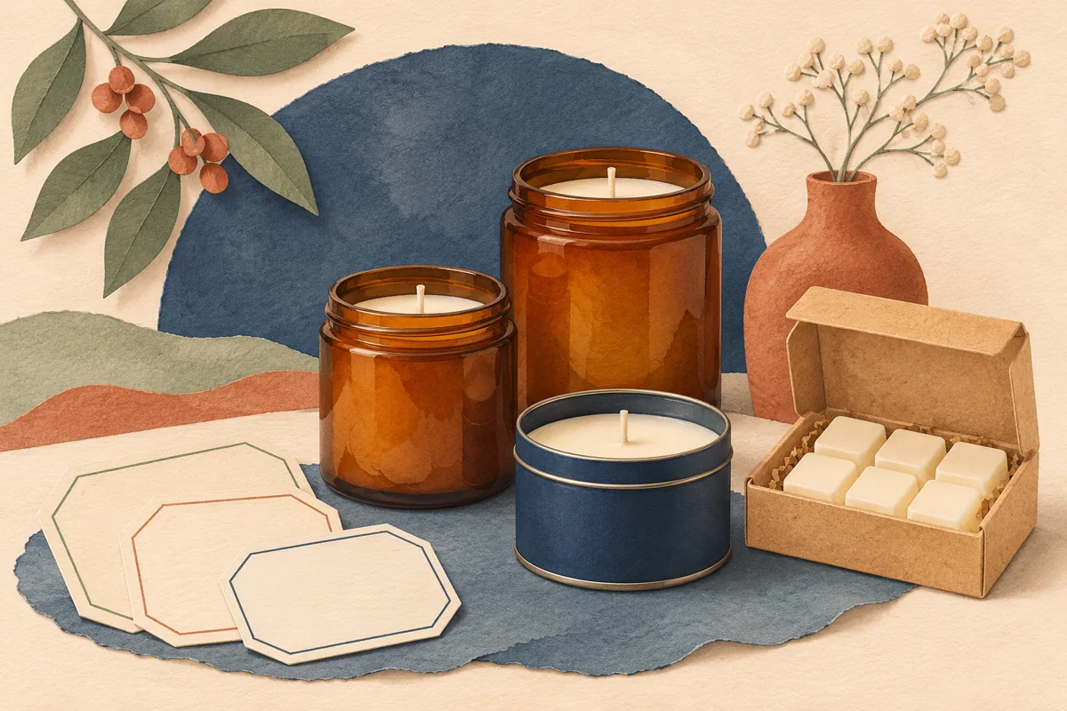
Luxury candle labels work best when the vessel, print and typography feel like one design. An ivory label can complement one glass and look washed out on another. A thin rule may reveal uneven placement once applied. Compare physical proofs on the intended vessel before choosing a look for the range.
01
Decide what should draw the eye first
Choose the strongest visual feature of the complete package. It might be the silhouette of the glass or the scent name on the label. If the vessel has a strong colour or texture, a simple panel gives it space to show. If the vessel is visually plain, a single typographic detail or a restrained motif can give the front more character.
Make one draft using only the brand, candle type and scent. Set the elements in a consistent alignment and check their spacing at the intended size. Add one accent after the hierarchy works. Judge what that accent does to the whole jar before adding more. Check how the accent sits against the vessel when you place the draft at finished size.
02
Compare two designs on the same vessel
Imagine a fictional range with amber jars and scents called Cedar and Soft Amber and Wild Fig. Prepare two front proofs using the same jar, dimensions and wording. Version A places the scent in the centre with a small brand mark above. Version B keeps the same order and adds a thin line to divide the scent from the product type. Changing one detail at a time makes the comparison easier to interpret.
Print both versions at finished size. Position each on a matching empty vessel and compare them in ordinary room light. Turn the jars slightly to see where the sides of the label appear to narrow. A border may exaggerate small placement differences on curved glass. Choose the version that holds its balance under realistic application conditions.
03
Give the print supplier a clear brief
Specify the vessel material, intended application area and expected handling. Ask the supplier to confirm a suitable stock and adhesive combination. Request a sample in the proposed finish if the texture or appearance is part of the decision. A paper mockup helps you choose the shape and layout, while a production proof shows how those choices look on the intended material.
Confirm the finished dimensions, bleed, safe area and required file format with the supplier before exporting from Canva. Leave space around essential wording and keep any approved supporting information readable at the intended size. If you consider foil or another finishing process, ask how to prepare the artwork and request a proof of the exact treatment.
04
Score the physical proofs
Use the same checks for each sample. Give each criterion a score of 0 for revise, 1 for acceptable or 2 for ready. Compare the results beside the physical jars and note one observable reason for each low score. Revise any proof with a zero before approving a print order, even if its total is higher than another option.
| Criterion | A proof is ready when |
|---|---|
| Reading order | The intended focal point is clear and the scent is readable at a normal viewing distance. |
| Spacing | The longest scent name fits comfortably with room around the edges. |
| Placement | The front looks aligned when the jar is upright and slightly turned. |
| Finish | The label surface and printed colour work with the vessel under expected lighting. |
| Consistency | The short and long scent variants look like part of the same collection. |
05
Keep the approved sample with your print files
Record the vessel reference, label dimensions, material, finishing treatment and approved artwork revision. Keep a physical sample for future comparison. Include a close photograph of the intended placement if different people will apply the labels. Save the proof notes beside the editable file and the final print export.
When you add a scent, begin with the approved layout and check the new wording against the same rubric. If you change the stock, vessel or printer, review another physical sample. That repeatable approval process protects the details you chose for the range.
BEFORE YOUR NEXT STEP
Your practical checklist
- Choose a focal point for the complete vessel and label.
- Compare two proofs with one design difference.
- Confirm material and artwork requirements with the supplier.
- Score placement, hierarchy and finish in normal light.
- Keep the approved sample and artwork revision together.
Questions & answers
Do luxury candle labels need foil?+
Foil is an optional finish. Carefully spaced type and an appropriate stock can be enough. If you use foil, review a sample in the intended light to see how it works with the vessel.
Can I approve the design from a digital mockup?+
A digital mockup helps with early comparisons. A physical sample on the intended vessel shows placement, readability and finish at the finished size.
Sources & further reading
Official references for the technical points in this guide. Check current specifications before production.