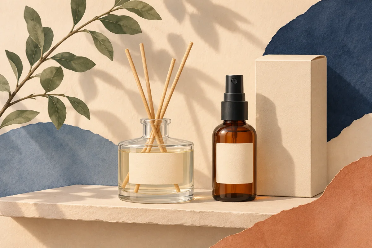
A reed diffuser is usually seen as a group of parts: the bottle, its closure or collar, the reeds and sometimes a tall gift box. Good packaging design makes those parts feel related while keeping the product easy to identify. It begins with the assembled presentation rather than a label floating on screen. This guide explains how to plan the visual hierarchy, allocate content and prepare a proof. It does not specify formulation, instructions or legally required wording; those need review for the actual product and sales market.
01
Consider the entire silhouette
Put the intended reeds, bottle and collar together without the finished product. Look at the proportions from a normal viewing distance. A label that occupies nearly the entire bottle can compete with an elaborate collar; a very small label may be lost below tall reeds. Compare a few paper shapes before editing the decorative artwork.
Photograph the mockup from the front and slightly above. These are useful planning views because shoppers may encounter both angles online. Check whether the collar or closure hides the top edge of the label and whether a curved bottle wall makes a straight paper rectangle crease. Record the usable surface, not simply the bottle's total height.
02
Choose a readable brand-and-scent system
Use one consistent order for the brand, product type and scent. The product type matters when a customer cannot immediately distinguish a diffuser bottle from another home-fragrance product. Keep the longest scent name in mind while establishing type sizes and line breaks. Decorative spacing should support identification rather than separate connected words so widely that they become difficult to read.
In a hypothetical range, Lavender Field and Bergamot with Cedar can share a master even though the names have different lengths. Give the scent its own generous text area, then set supporting text in a secondary position. Compare both names on bottles side by side. If the longer name changes the entire balance, adjust the common layout rather than forcing only that variant into smaller type.
03
Assign information to bottle, box and insert deliberately
Make an inventory of the content approved for the actual product. Decide what must remain with the bottle and what other information can appear on the outer package or an insert after qualified review. Do not assume an insert can replace a necessary package label, or that a decorative bottle sticker is sufficient because the carton has more text.
A planning example could assign product identity to the bottle front, longer approved information to a supporting panel, and a short brand note to an insert. The exact allocation is product-specific. Make sure decorative phrases do not displace information that the responsible reviewer needs to keep visible. Leave enough room before choosing fine ornamental borders.
04
Build the tall box around real folds
Ask the box supplier for its dieline or panel dimensions. Identify front, back, side panels, folds and any areas reserved for joining the box. A long vertical design can look elegant, but the product name should still be easy to read in a shelf photograph. Rotate only the elements that genuinely benefit from that treatment.
Print a rough paper version and fold it before approving the artwork. Watch for a botanical element that breaks awkwardly across a corner or a word sitting too close to the opening flap. Follow the supplier's safe-area and bleed requirements. Bottle artwork, a box dieline and an insert are separate production files, even when they share the same typography and palette.
05
Review the assembled presentation before ordering
Ask the label supplier about stock and adhesive suitability for the bottle surface and expected conditions. Check any performance statements against the exact print construction. A label design file cannot demonstrate resistance to product contact or establish packaging safety. Keep supplier specifications with your proof notes rather than relying on visual appearance.
Inspect the complete presentation in ordinary light and in the photography setup you plan to use. Confirm that scent names match on bottle, box and insert. Store approved exports with format and version identifiers so a replacement bottle label is not confused with a carton file. Repeat the fit check whenever a packaging component changes, even if its advertised capacity remains the same.
BEFORE YOUR NEXT STEP
Your practical checklist
- Assemble bottle, collar and reeds for a proportion check.
- Measure bottle and box panels individually.
- Keep product identity and scent in a consistent hierarchy.
- Review information placement with the responsible product adviser.
- Proof a folded box and a labelled bottle together.
Questions & answers
Should a diffuser bottle label match the gift box exactly?+
Match the brand system, not necessarily every layout element. Bottle and box dimensions differ, so adapt hierarchy and spacing to each surface while retaining recognisable typography and motifs.
Can decorative templates supply diffuser instructions?+
Do not assume so. Use instructions and other product information approved for the actual formulation, packaging and market; then fit the design around that content.
Sources & further reading
Official references for the technical points in this guide. Check current specifications before production.