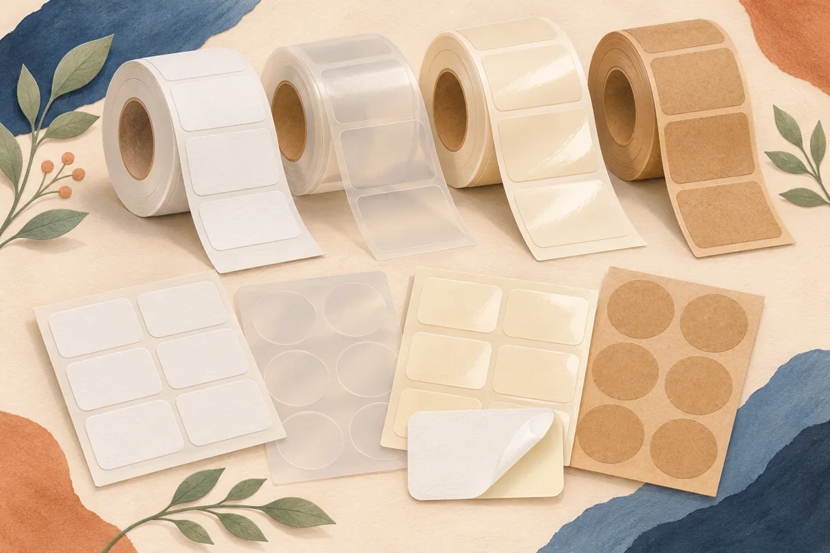
Clear label stocks can look noticeably different once applied. One may blend into the glass, while another leaves a softly frosted panel. Compare the physical appearance you want and the words you need to read before choosing a finish from a screen preview.
01
Choose the appearance before naming the material
Describe the finished effect in a short brief. You may want the glass to show through almost unchanged, or you may prefer a softly visible panel framing the text. A supplier’s stock names can vary, so share the visual goal and ask for its closest options.
Avery’s guidance notes that a glossy clear label can give a more transparent appearance than a frosted option. Treat that as a starting point for requesting samples. The complete construction and your container surface still need to be viewed together.
02
Apply both samples to the same background
Use matching clean, dry containers and follow the supplier’s application instructions. Place the samples at the same height and orientation. Compare them under the lighting used in your product photographs and on the display surface where customers will see the package.
For an illustrative amber bottle, check the text over the dark glass and against a pale backdrop. On a clear jar, compare the area backed by the product with the empty glass above it. The same label can read differently across those two backgrounds.
| Observation | What it helps you choose |
|---|---|
| Unprinted area | How much of the surface remains visible |
| Cut edge | Whether the panel looks deliberately framed |
| Small text | Which stock and ink combination reads clearly |
| Listing image | How reflections affect the finished presentation |
03
Separate white artwork from white ink
A white area in a digital preview can mean unprinted space when it reaches a clear stock. Ask whether the printer offers white ink and what file preparation it requires. If you need an opaque backing below the text, describe exactly which elements should receive it.
Keep the proof simple while comparing stocks. Use the same small type, a dark block and an unprinted area on both samples. Changing the layout, ink treatment and finish at the same time makes it harder to tell what created the visual difference.
04
Approve the sample in a real product photograph
Photograph both finished samples using the intended listing crop. Check whether the words stay readable when a window reflection moves across the glass. Adjust the lighting and container angle, then review the material again before changing the design.
Record the approved stock code, finish, ink process and container model. Keep a physical sample when possible. If you later change the jar color or add a frosted coating to the container itself, repeat the comparison because that background becomes part of the label’s appearance.
BEFORE YOUR NEXT STEP
Your practical checklist
- Describe the visual effect to the supplier.
- Compare stocks on matching containers.
- Confirm white ink requirements.
- Save the exact approved construction.
Questions & answers
Does clear mean completely invisible?+
The stock, adhesive, finish and container affect the appearance. Review an applied sample to see the panel and its edge.
Can I use the same artwork on both finishes?+
You can compare one artwork file, but proof the text and any white backing on each physical construction.
Sources & further reading
Official references for the technical points in this guide. Check current specifications before production.